Devilish Details of a 1960's Motel Renovation
July 30, 2019
Seven months ago, I published our very first blog post. Holy Cow, we’re Buying a Motel! was published a day before we closed on the purchase of this 1960’s motel in the heart of the famous Hwy 290 Wine Trail in Stonewall, TX. Since then, we’ve almost killed ourselves with a tough renovation, opened up the hotel to guests, brought on a new investor and are now planning for our phase 2 – CABINS! This follow up blog revisits the early days, our journey over the last 7 months, some before and after photos, and the great vendors and people that helped us along the way! Enjoy!
They say the devil is in the details, and they’re not wrong. When we first started this project, we knew that we would have to make a ton of decisions. But I don’t think we appreciated just how many little decisions there would be! Selecting every stick of furniture, every finish, and every fixture has been an enormous job. But it’s been so much fun to stretch my design wings and see it all come together.
I knew that if we were going to have a motel that was as fun and interesting as the surrounding wine country, we’d have to make it something special. This area is a unique blend of historic attractions meets new small businesses. So, we wanted to make sure to honor the history of the motel while bringing it into the present.
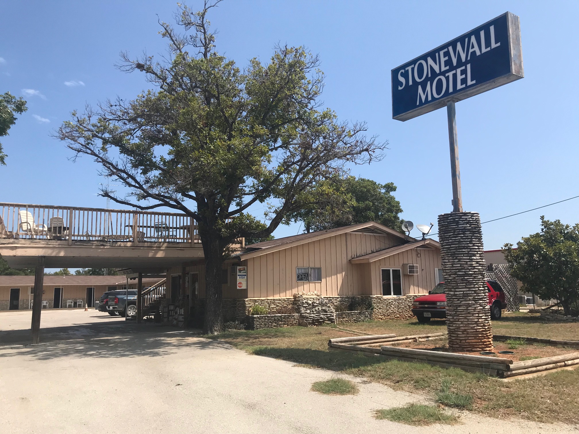
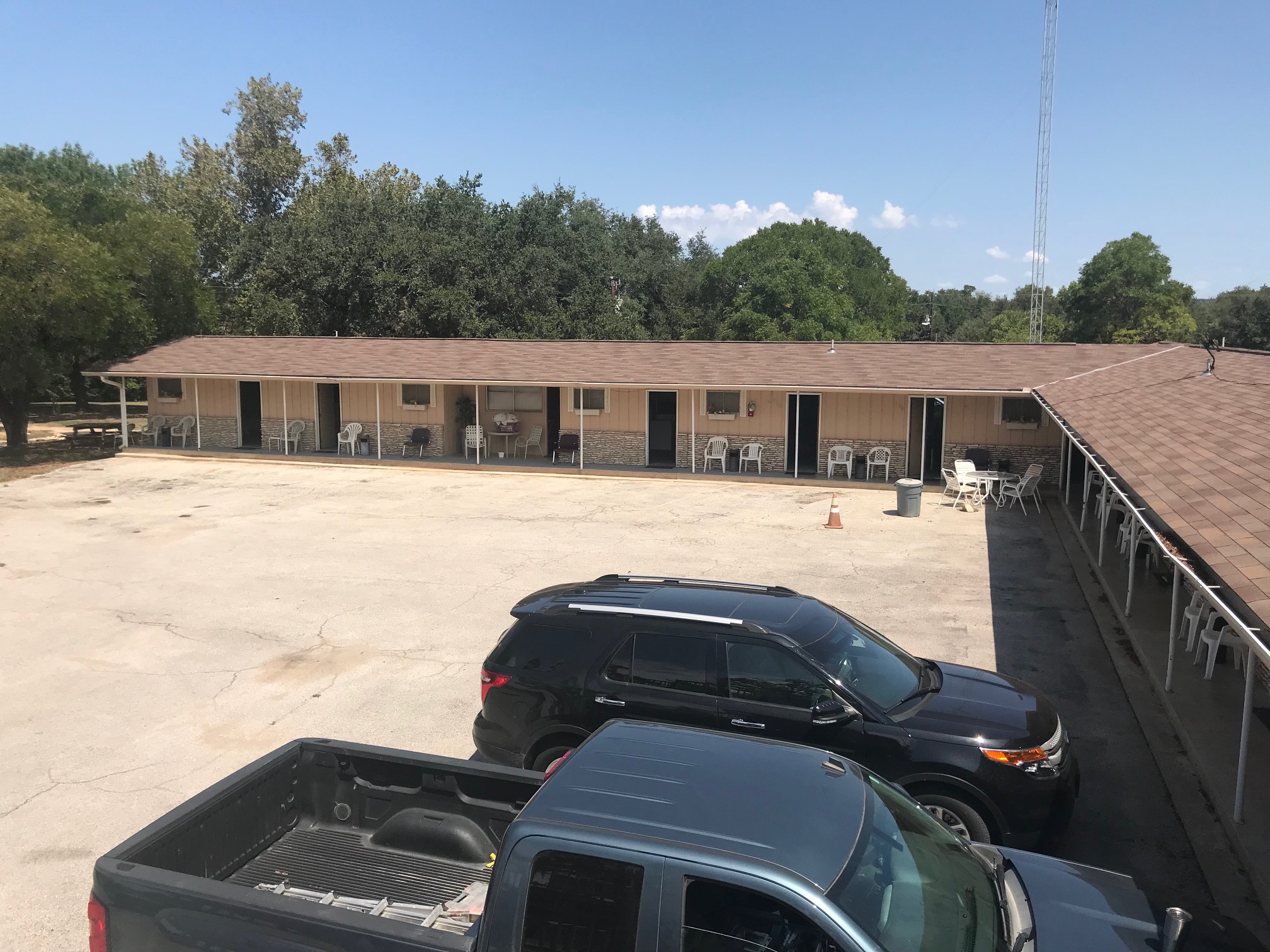
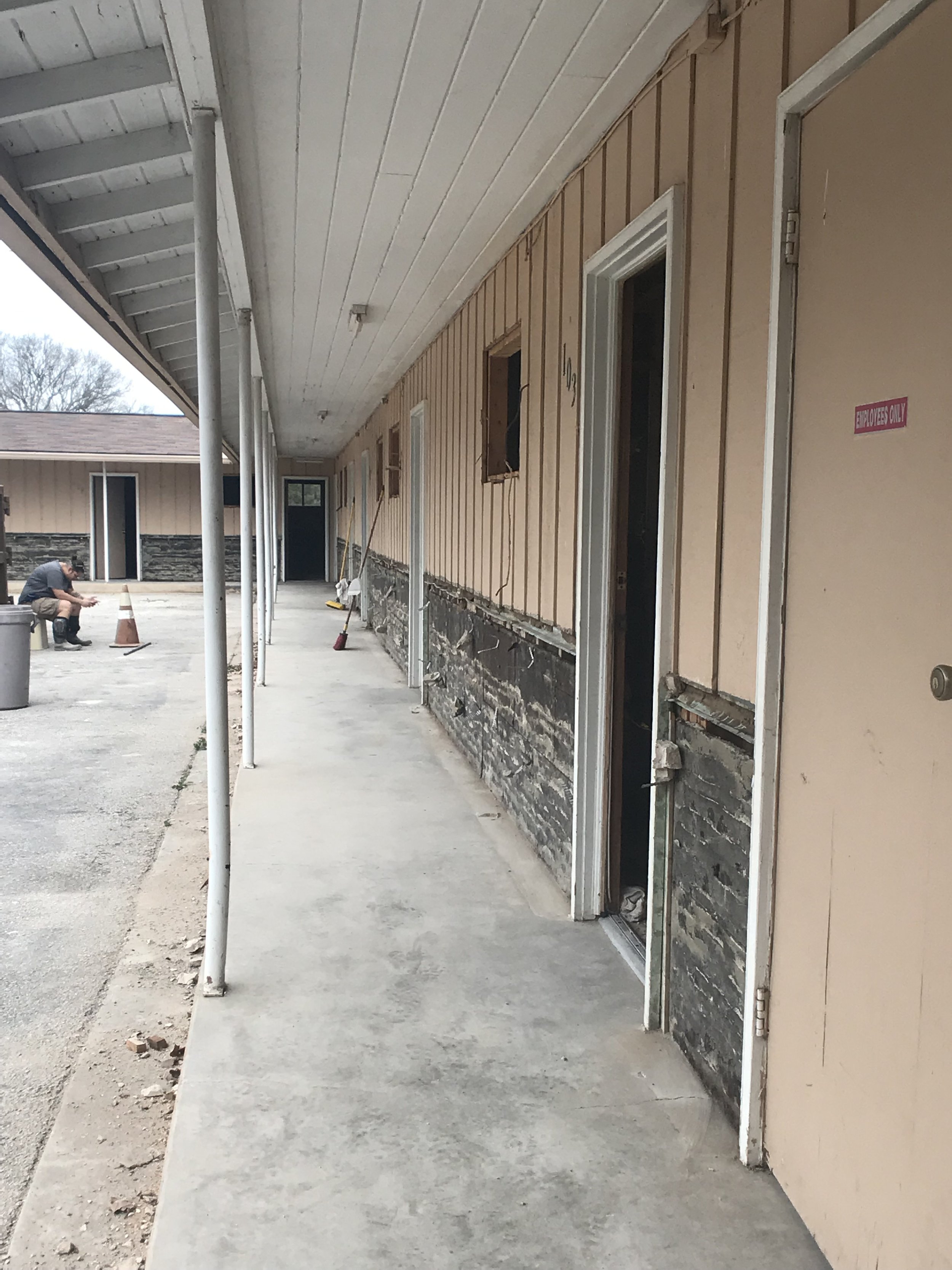
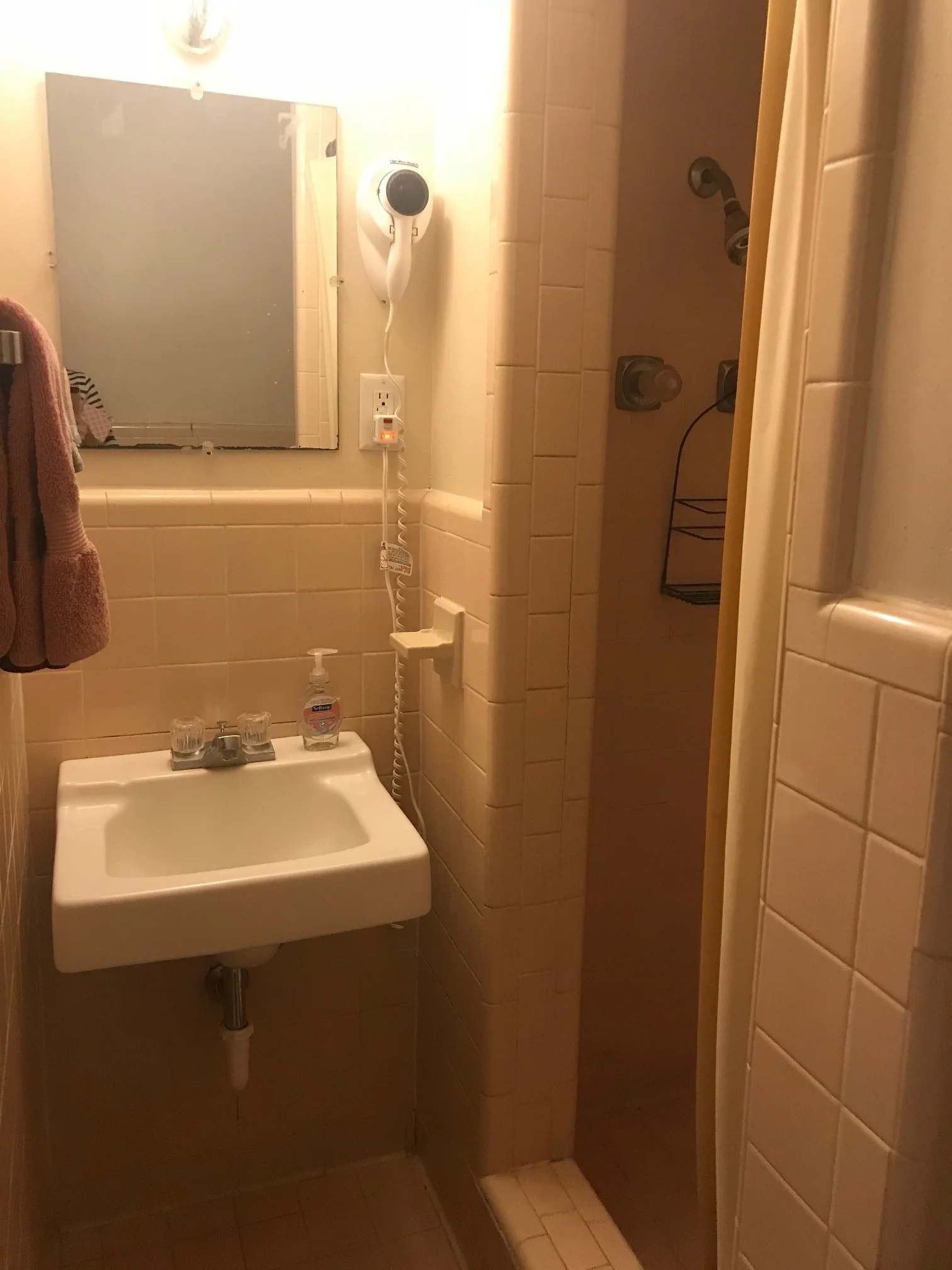
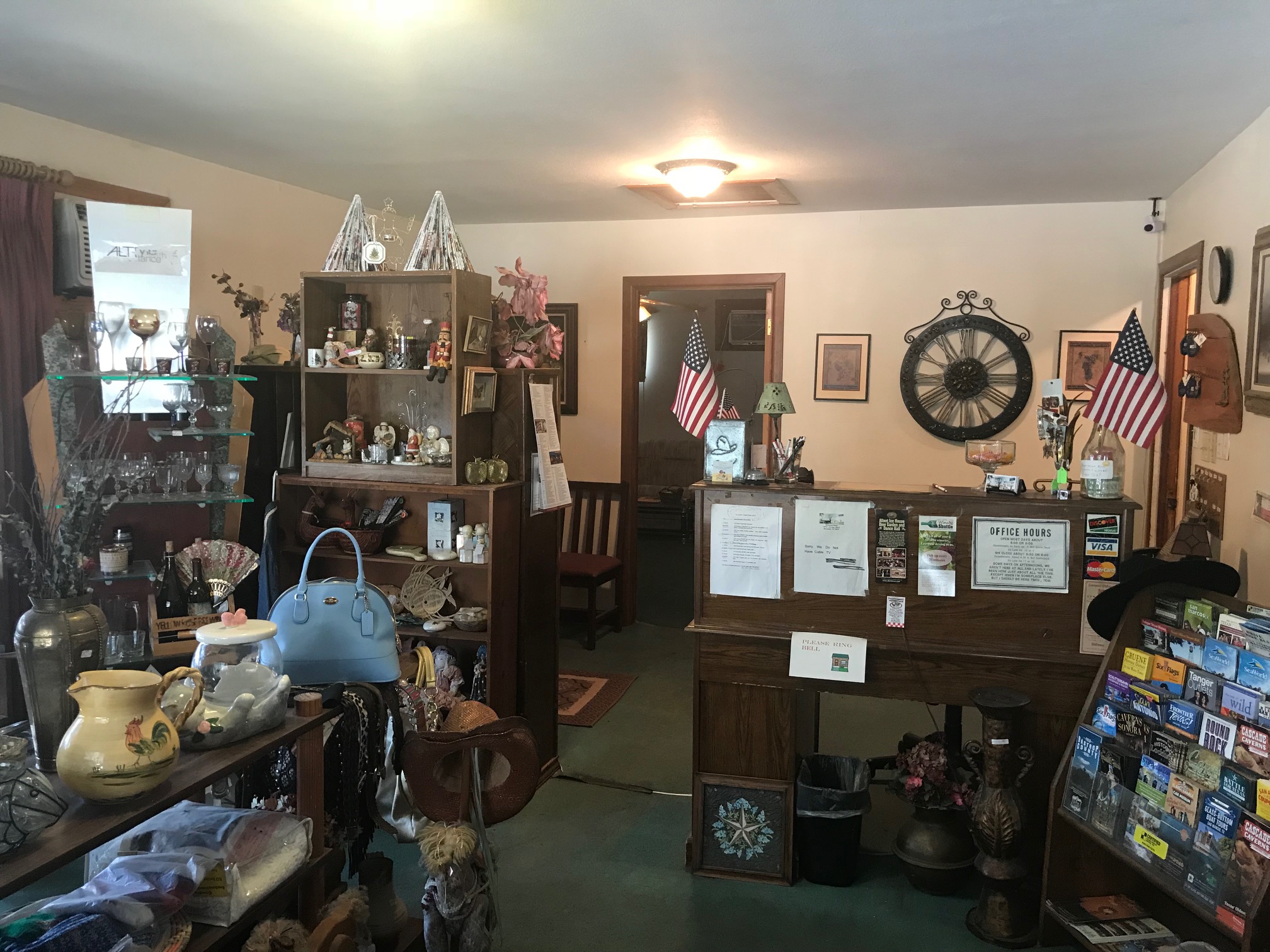
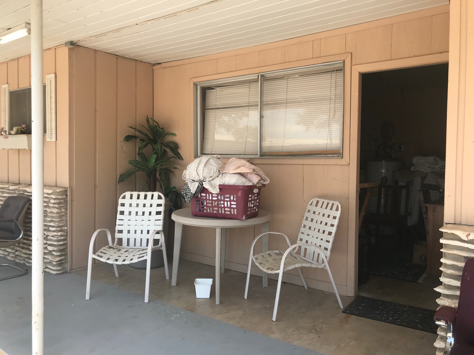
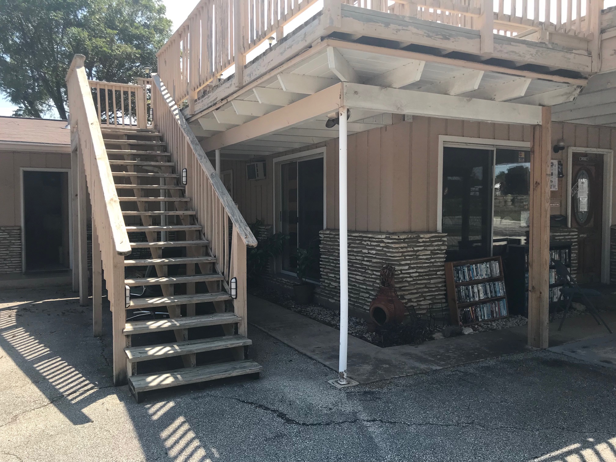
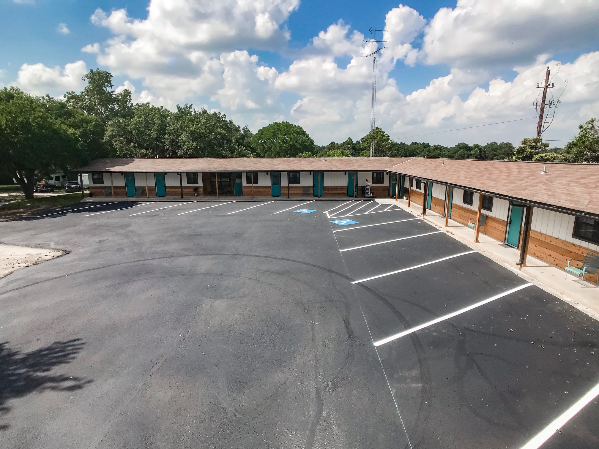
Before we get into the “Afters”, let’s look at the “Before”. When we found the hotel two years ago, it needed some love. A classic, L-shaped, roadside motel built in 1964, the former Stonewall Motel had seen better days. We had good bones to work with, but it still needed a full renovation. Here are some pictures taken the day we closed on the property.
Without a North Star to guide design decisions, it’s easy to wind up with elements that compete, rather than complementing each other. We knew that we wanted to create an upscale (yet approachable for everyone), relaxing guest retreat in each room. But what exactly that would look like wasn’t 100% clear.
So the first thing we needed was to build the SML brand — colors, fonts, and logos. Everything would trickle down from there. We brought on branding studio Deux South Creative for help. Their talented team helped to select our color palette, design logos, and create our graphics. We focused on a mix of mid century/vintage with a little southwest thrown in (after all, this is Texas!). Our marketing would focus on and compliment our unique traits – 1960’s roadside motel, at the “Heart of the Hwy 290 Wine Trail”, and its unique Texas history and tie to President LBJ.
Once that was done, we had the direction we needed to start putting this place back together. Now that the motel is in such good shape, I wanted to share all these little specifics of how we got to where we are.
While we completed a full gut renovation (including adding new windows and doors, replacing the rock wall with cedar, new flooring, bathrooms, and fixtures), we spent countless hours picking the items that would make up our guest experience.
The Exterior
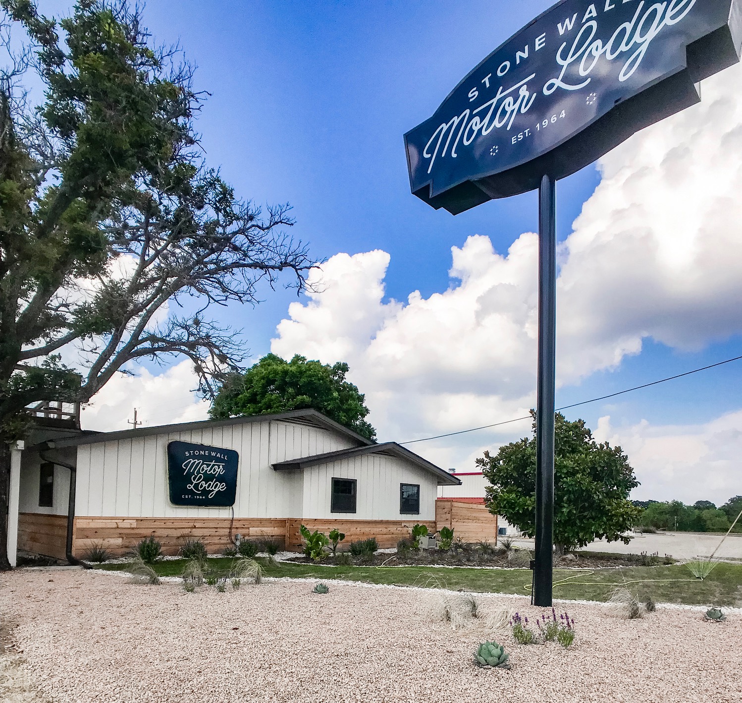
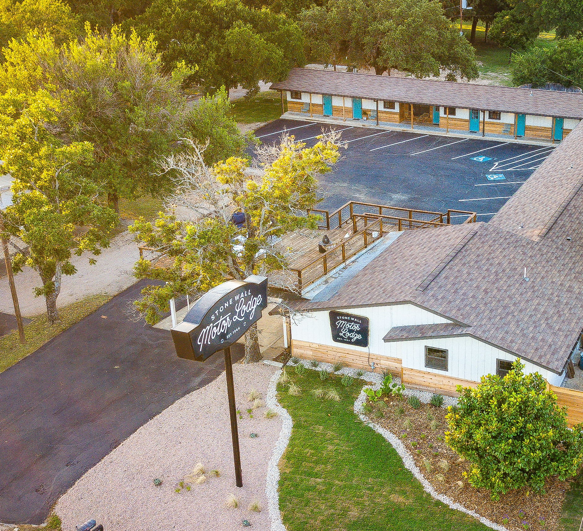
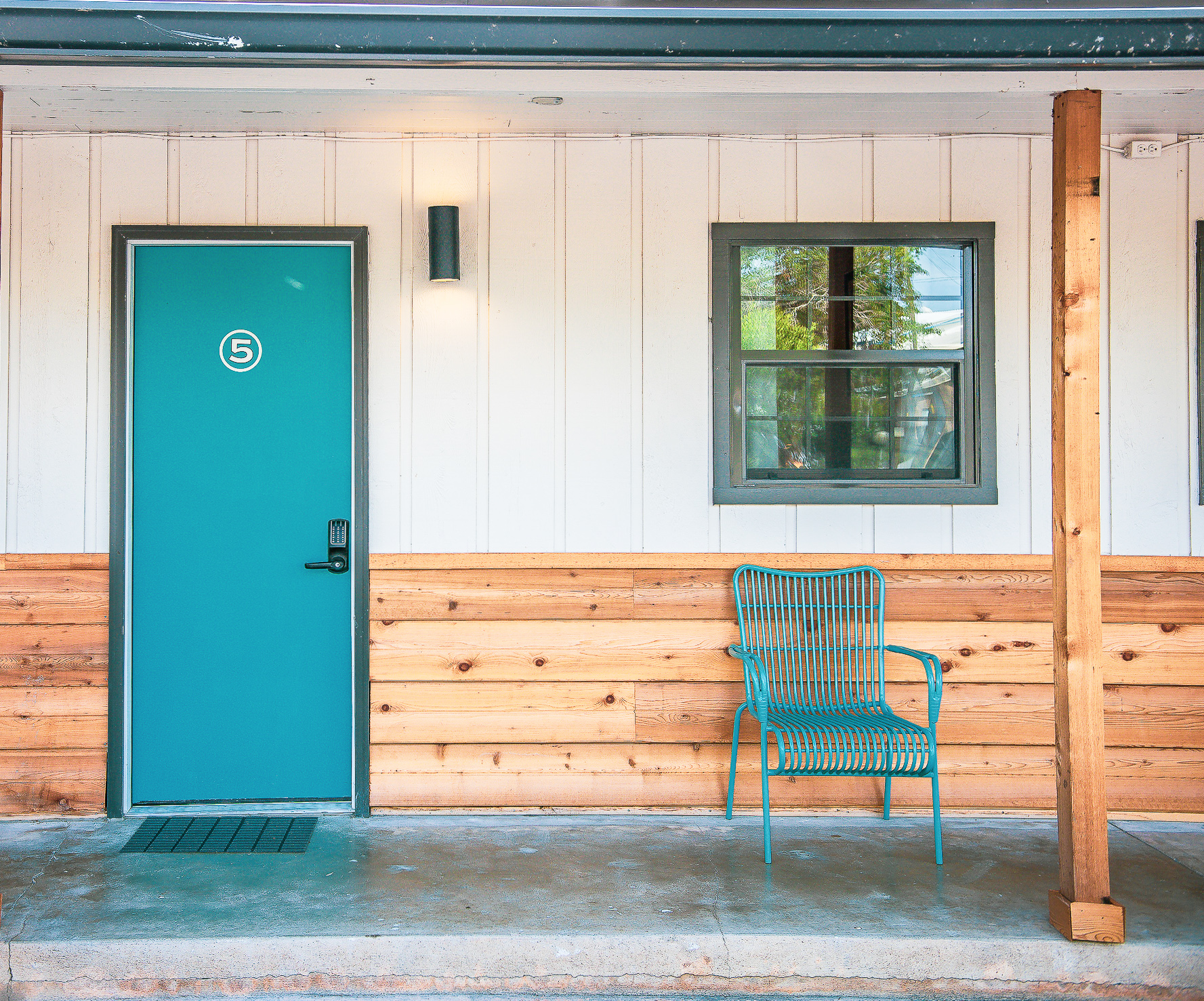
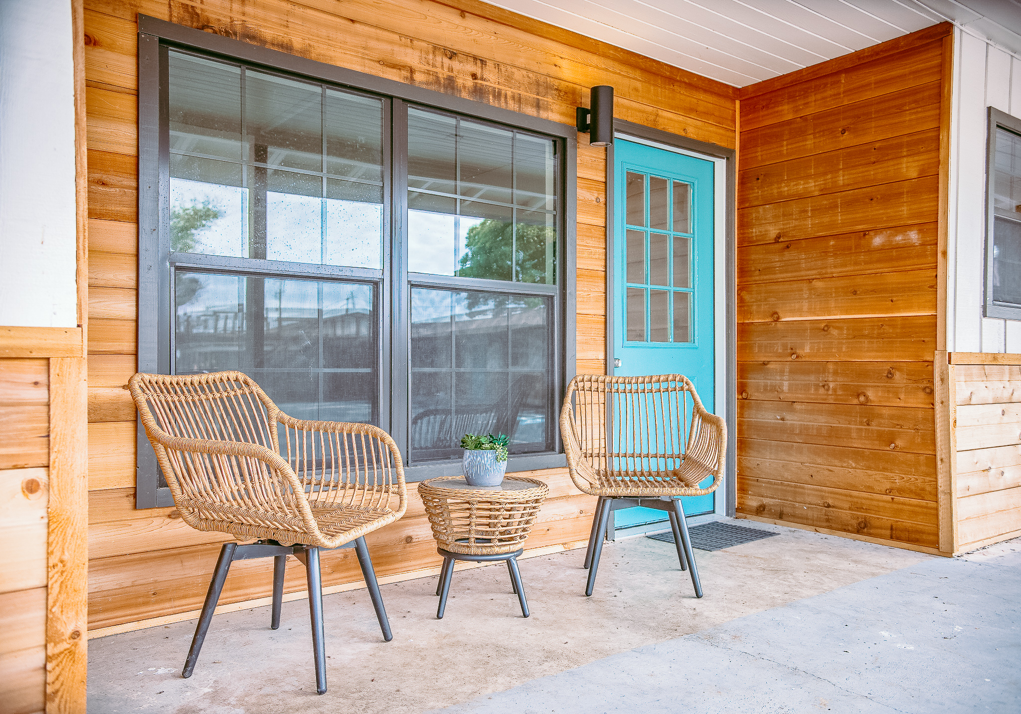
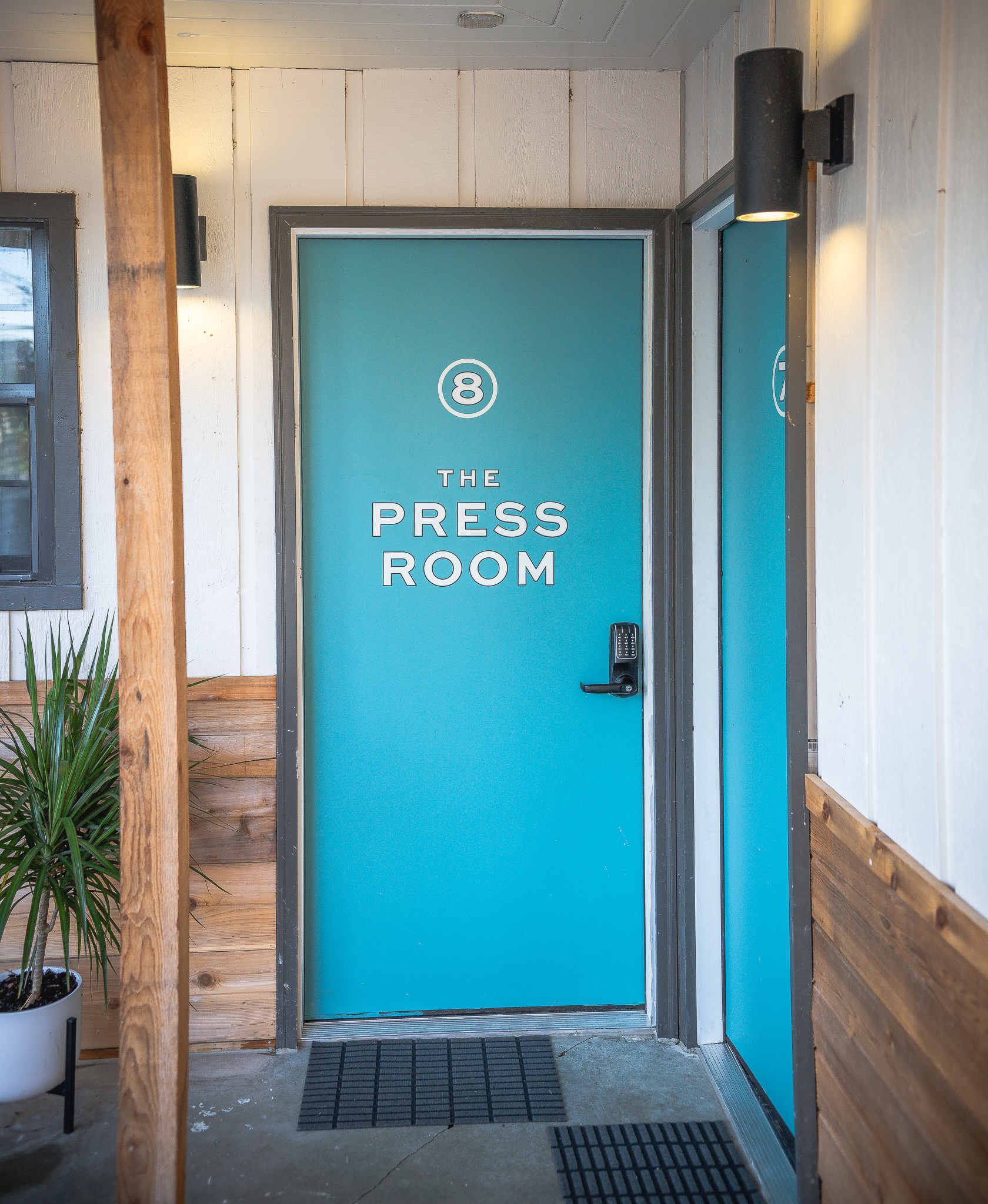
The hotel structure was in good shape and we liked the layout of the rooms for the most part. We knew we needed to transform the exterior and bring it up to date with new materials, new windows, and fresh colors. We started with removing the original stone half wall. It was grungy and broken in a lot of places, and we felt it didn’t fit the vision of what we wanted. We replaced it with beautiful horizontal cedar and replaced the metal support poles with wood. We enlarged the 2x3 windows to a 3x3 and changed to a dark bronze to better match the trim paint we planned to use (Urbane Bronze by Sherwin Williams). We kept the original siding in the front, but replaced all the doors and painted them a beautiful teal color called Gulfstream, also by Sherwin Williams.
We had Deux South create our community signage and room numbers. ❤️ . We added some simple seating and a few plants, and we’ve got the front complete (easier said than done!)

The Front
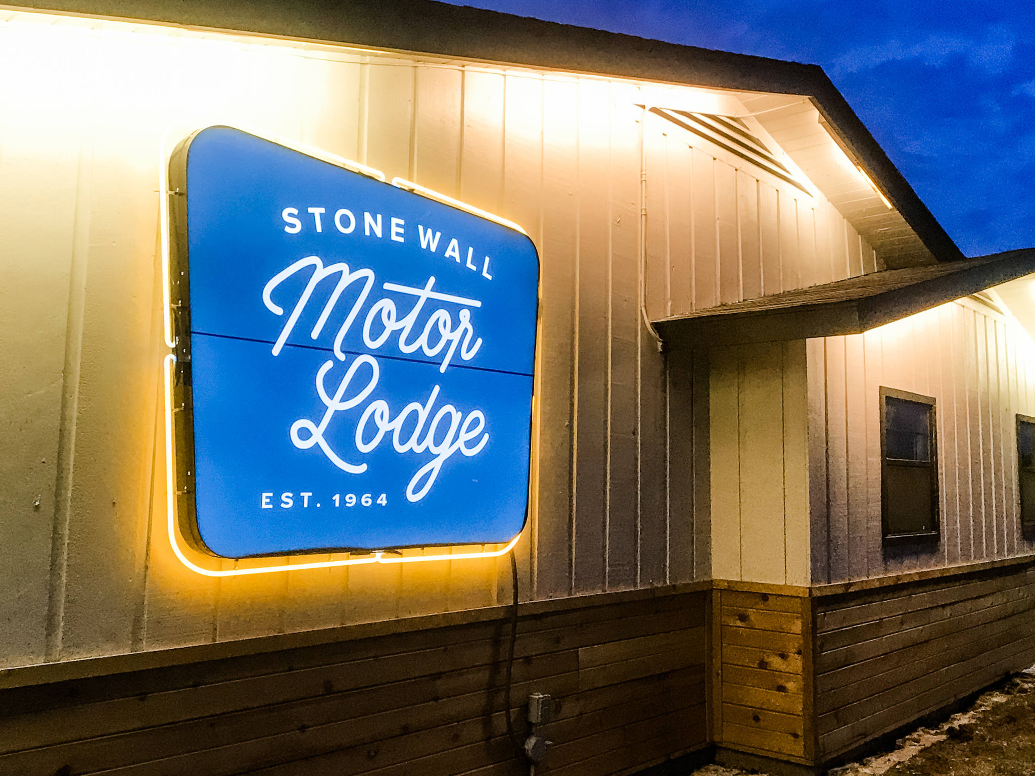
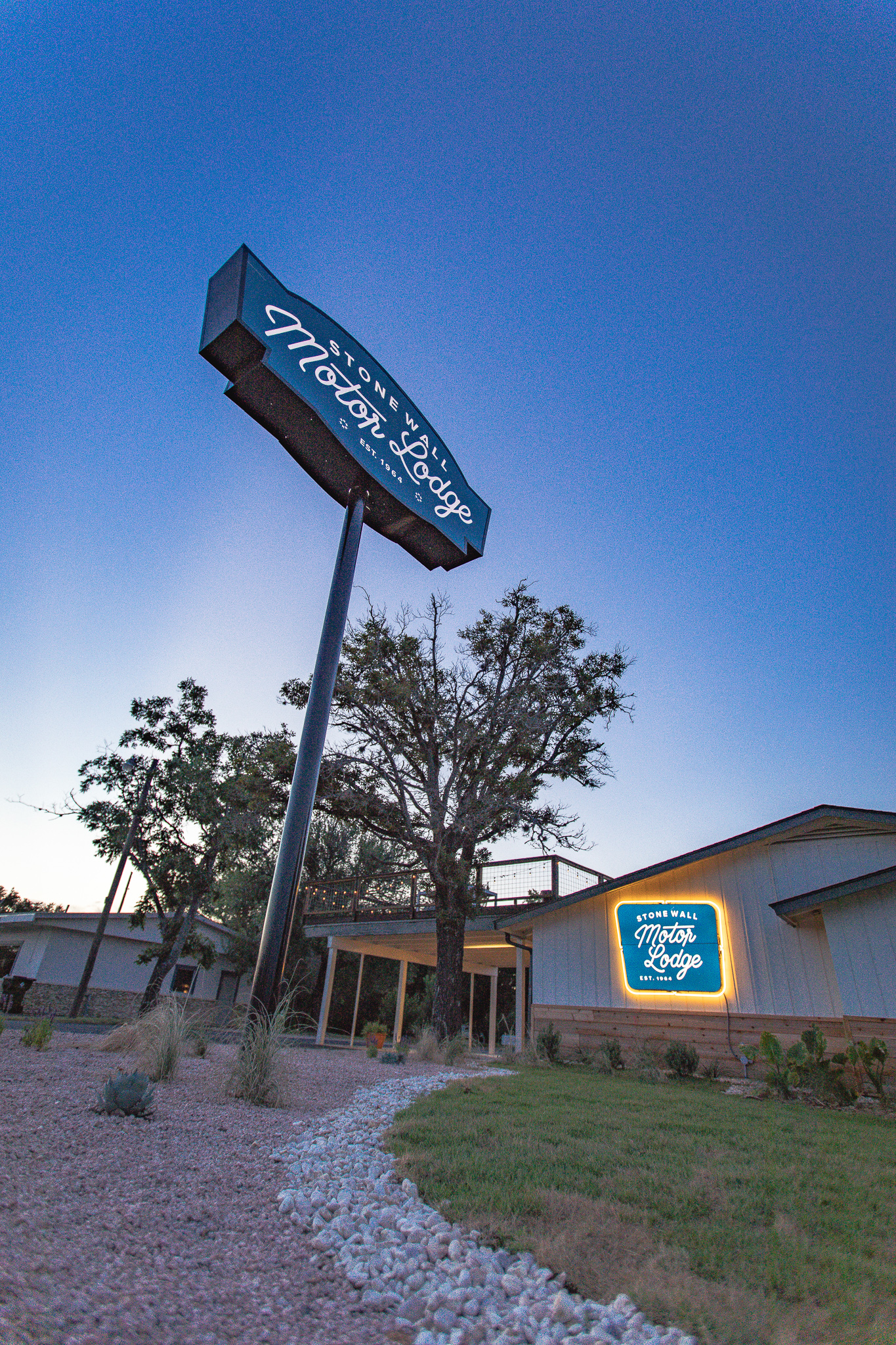
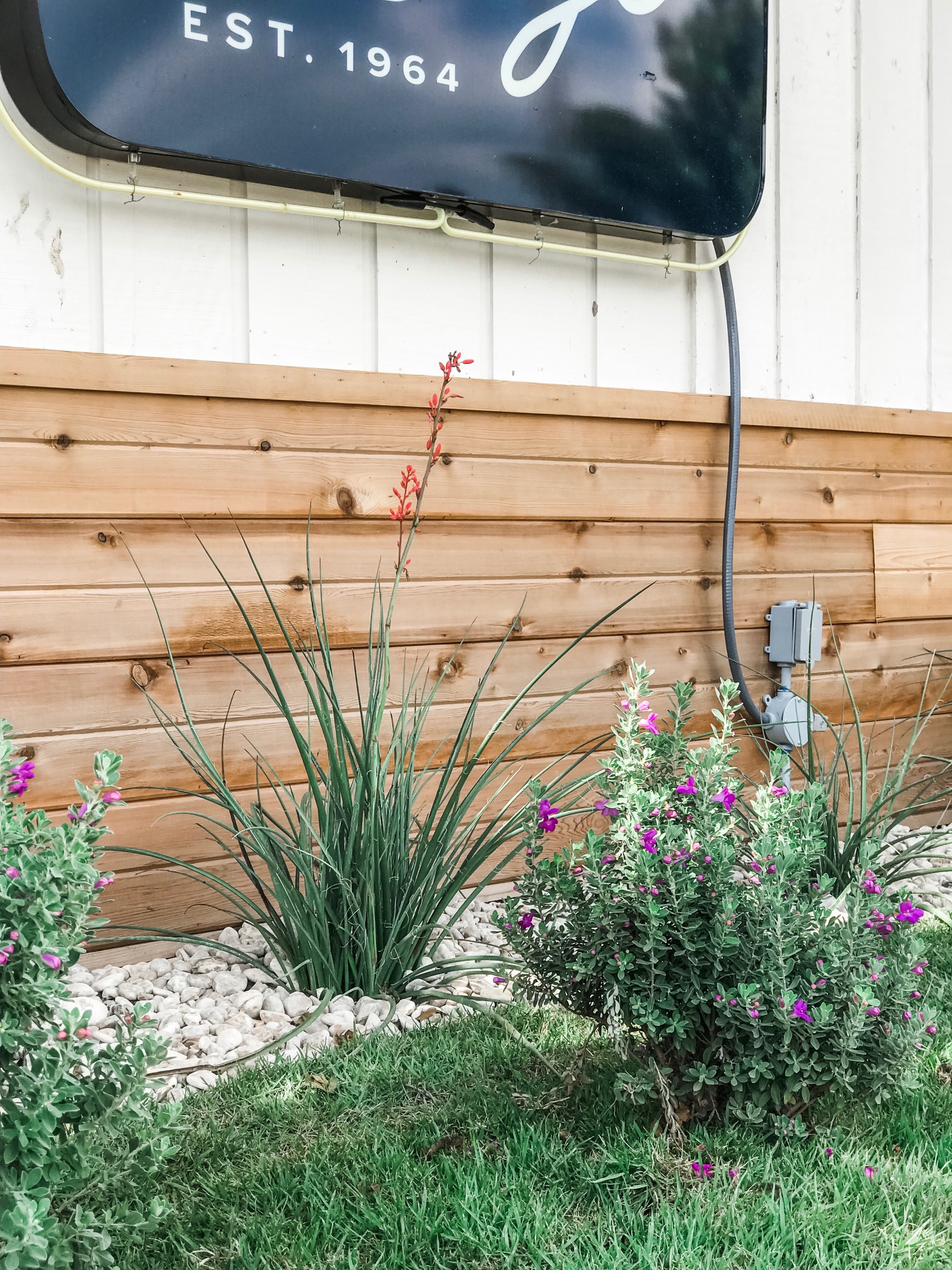
We decided to “go big or go home” with signage. We replaced the original sign with our new brand and logo design, increased the size, and took it up about 7 ft. We also added the wall sign, my favorite, and surrounded it with neon. You cannot miss this sign at night!
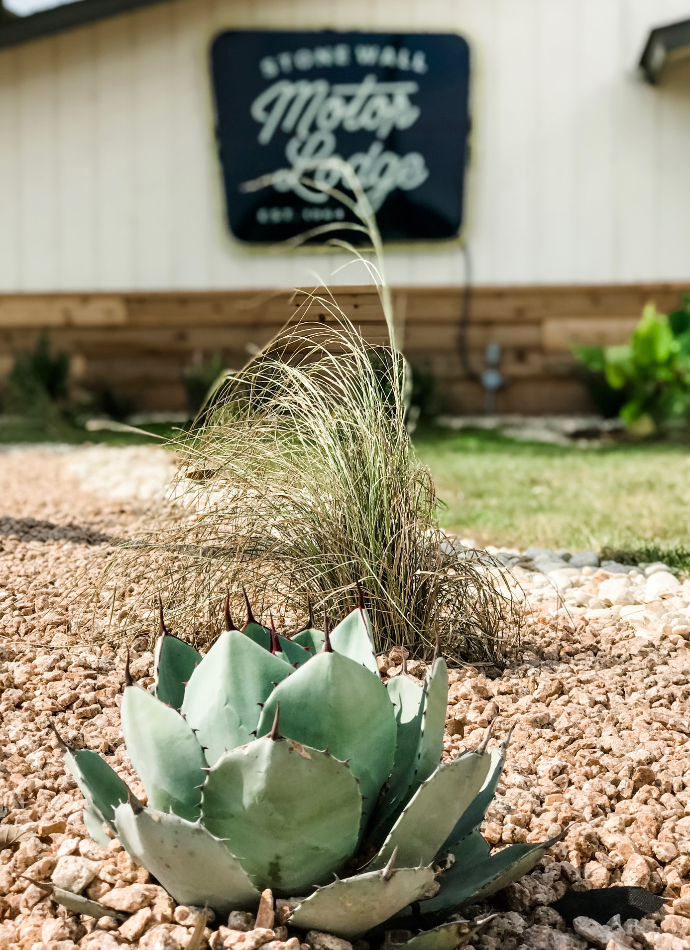
We hired a landscape architect who filled the front with a mix of grass, rock, and mulch, and added drought tolerant plants like Texas Sage, Red Yucca, grasses, and even these super cute artichoke agave plants. Once it all matures, it will be full and colorful.
The Guest Rooms
As a motel, getting the details right in the guest rooms was the most important thing. I knew I wanted guests to remember things like how comfortable the mattresses were, how soft the high thread count sheets were to sleep in, how they enjoyed some interesting art in their rooms, and how good the toiletries smelled.
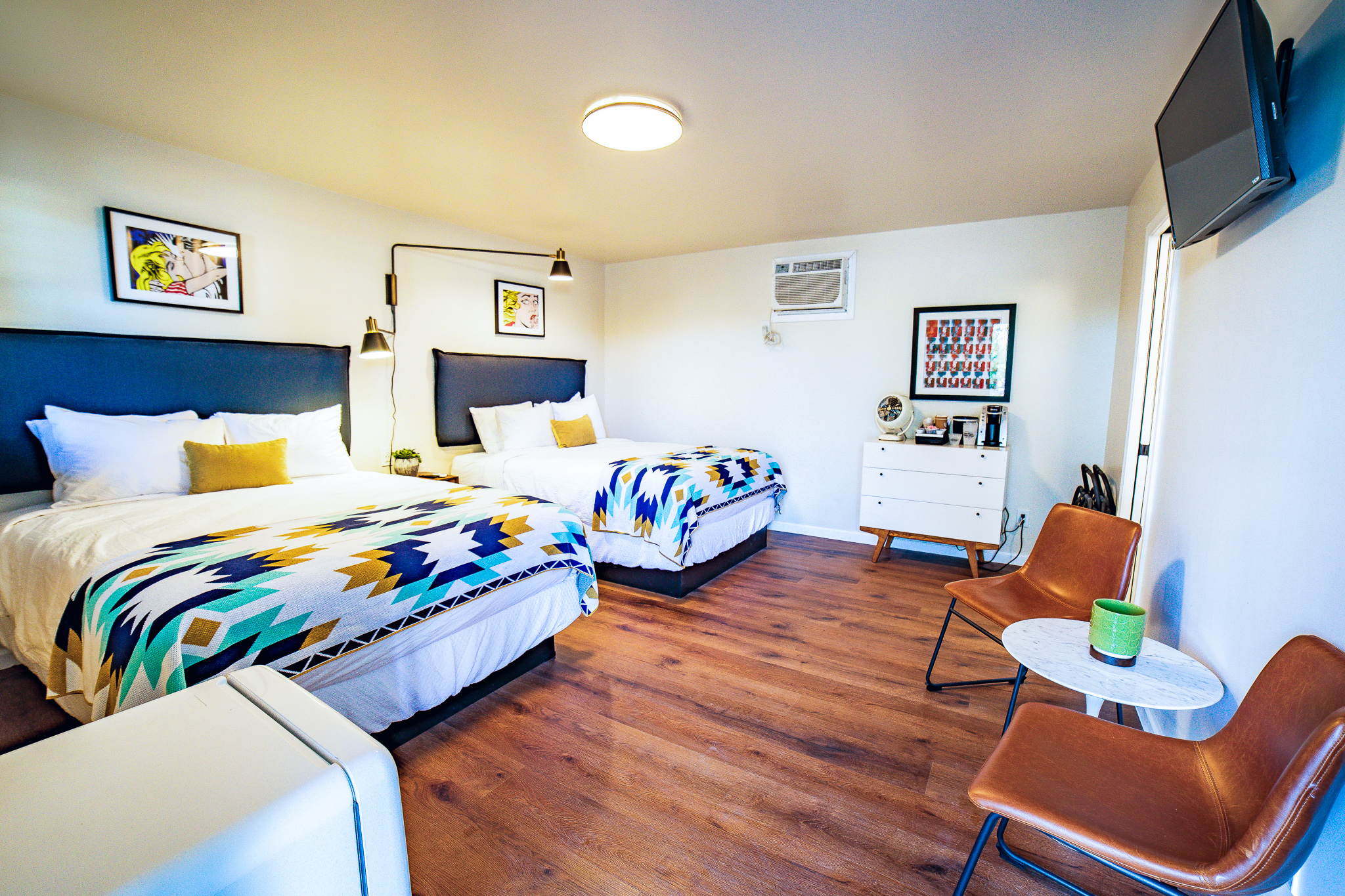
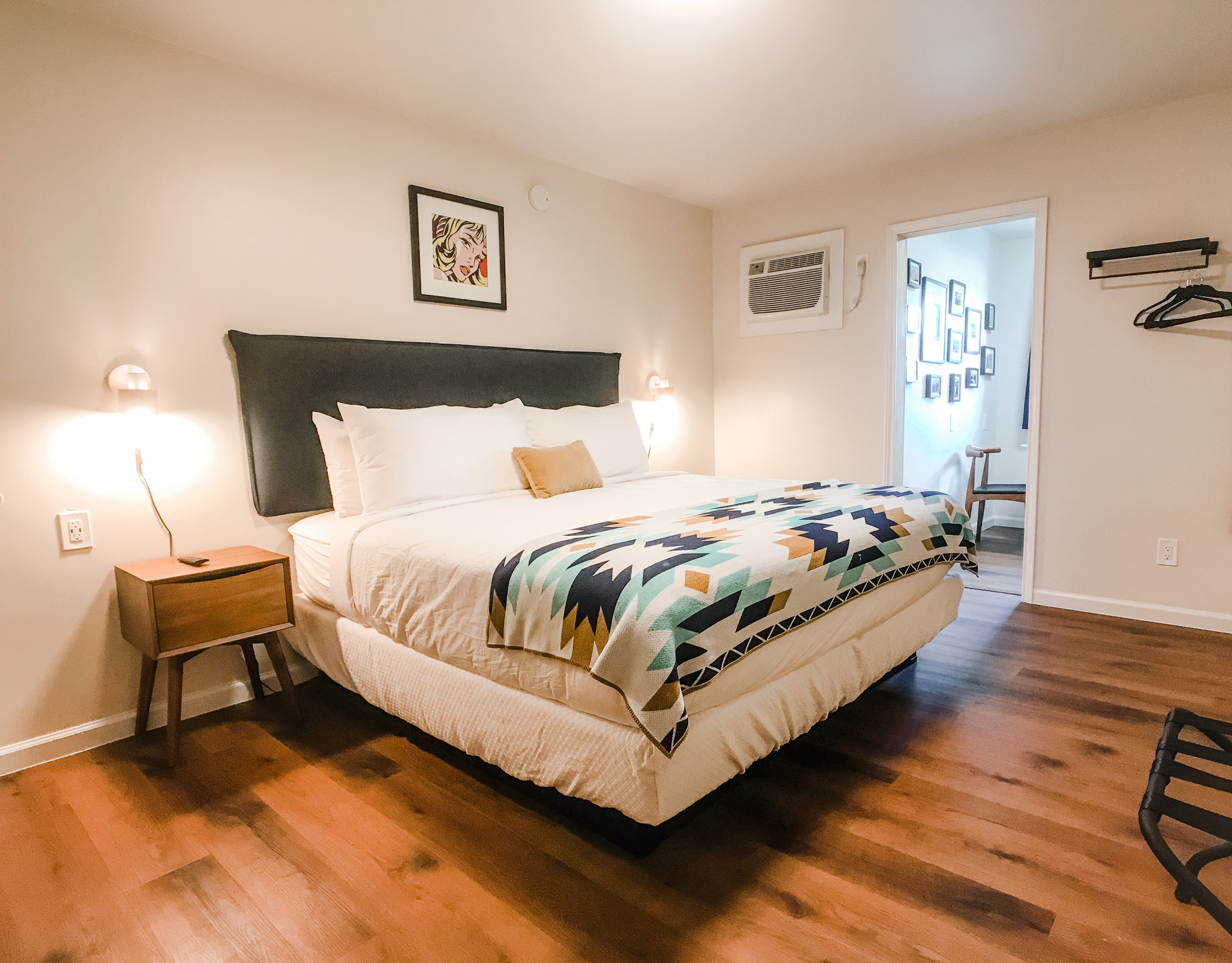
We wanted a really clean look, so we started with a frameless “floating” style bed base. The base is recessed under the mattress and are steel panels. No more stubbing of toes in the dark, easy for cleaning, and guests will never find anything unwanted under their bed!
Sitting on top is an ultra-comfy pillow top mattress from Serta Hospitality. We visited their manufacturing plant in Lockhart to find the right mattresses, which were then custom made just for us. We zipped them up with premium mattress encasements and mattress pads from Standard Textile, a premier provider of hospitality linens.
For bedding, our good friend Cody Ables at Codarus showed us crisp 300 thread count percale cotton sheets from Pine Cone Hill. (We LOVE this brand and know our guests will as well.) We’re using the triple sheeting technique rather than having a big bulky comforter, so guests can layer to adjust to weather. And as a bonus, it’s an easier method for our housekeeping staff.
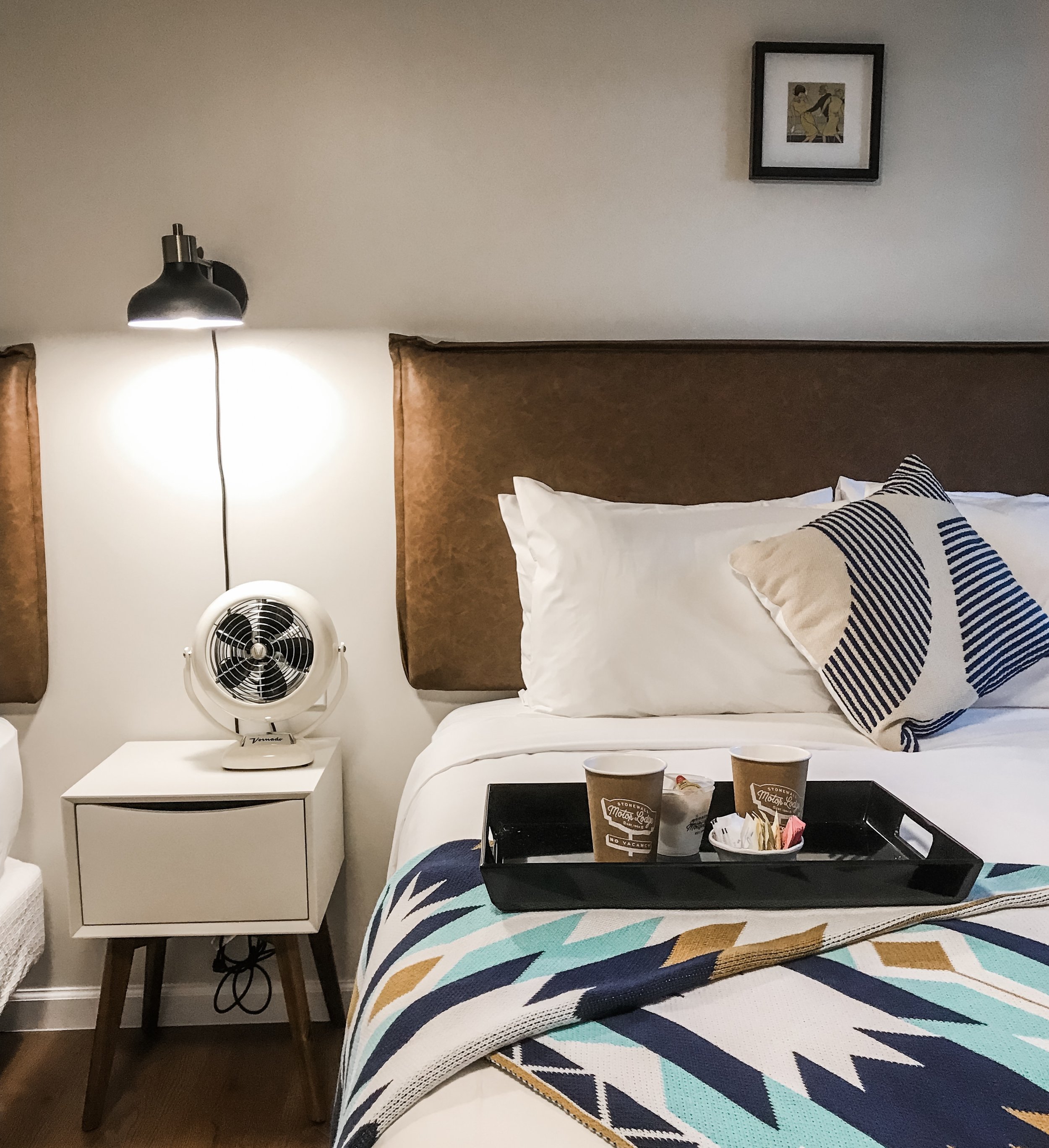
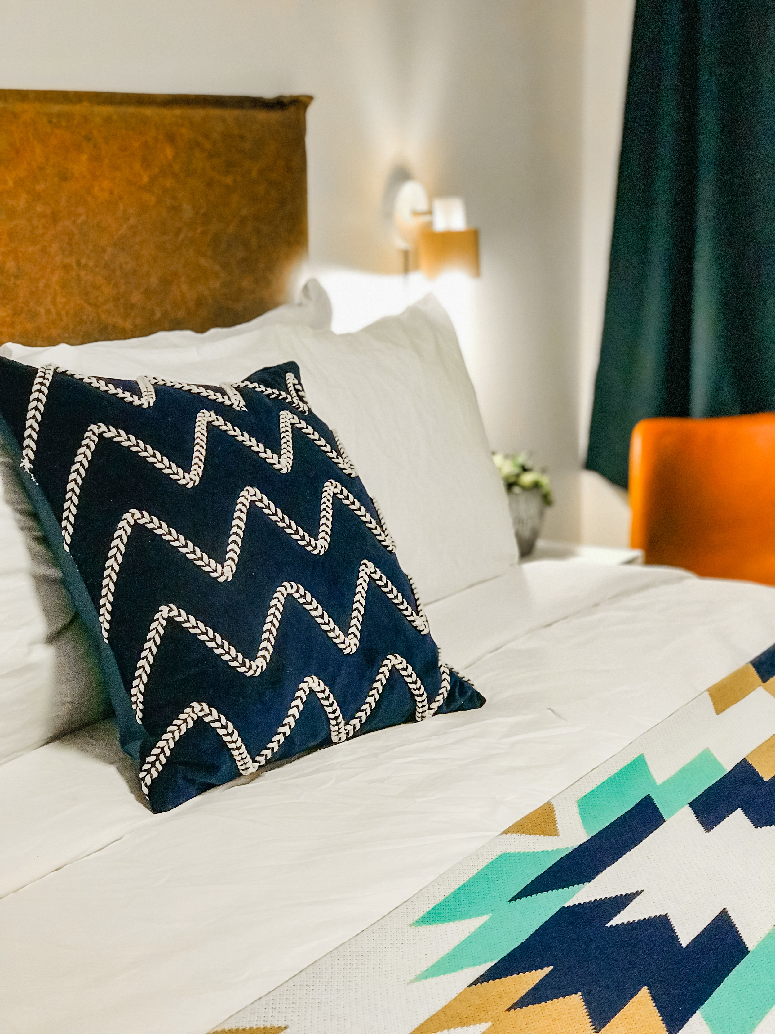
Topping off the bed is a custom blanket from Seek and Swoon, a super sharp small textile company out of Portland, Oregon. I worked one-on-one with the owner, Jala Smith-Huys to take one of her designs and make it our own – the SML Blanket. It plays on our geometric design elements along with our brand colors of navy, teal, mustard and white. They are super comfy and I know guests will be warm during the cold Texas Hill Country winter nights.
We wanted clean, simple, wall-mounted headboards and probably spent the most time searching for these to no avail. We finally tracked down the main manufacturer for most headboards made for firms like Joss & Main and Wayfair. The headboards are covered in a saddle brown leather or a rich midnight navy material. They are mounted directly to the wall to keep them from being too bulky and noisy, ensuring our guests have a solid night’s sleep.
Each room is a bit different – different furniture/headboards, artwork, pillows. We definitely didn’t want to be cookie cutter with our look. The original windows in the guest rooms were a 2’ x 3’ rectangle. We changed them to a 3’ x 3’ square to let in more light. But we also added wrap-around drapery rods and used lined drapes. We want guests to have the option to keep it dark and get as much rest as they need before they hit the wineries.
For the accent furniture in the guest rooms, we wanted something that was popular in the 1960s, but still looks fresh. We sourced mostly white and walnut furniture that had classic mid-century modern design elements, like the traditional flared legs on the side tables and dresser. I became obsessed with the Saarinen-inspired tulip table in each room!
We wanted lots of texture in the room so it feels lush. Velvet, twill, cotton, embroidery, leather, and wool all mix in with bright colors to contrast the light walls.
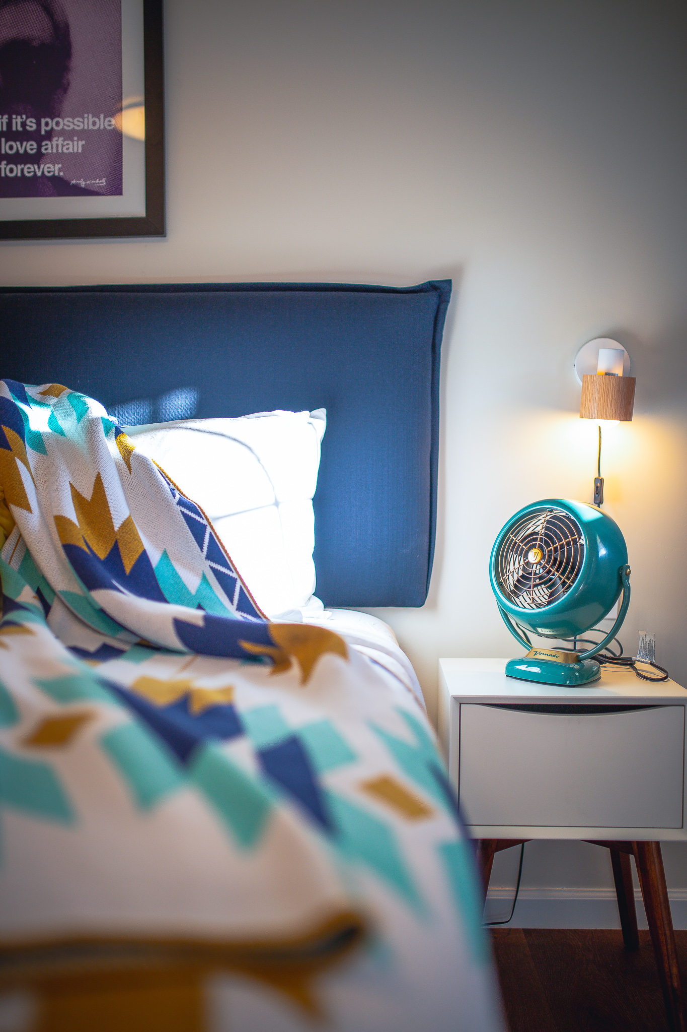
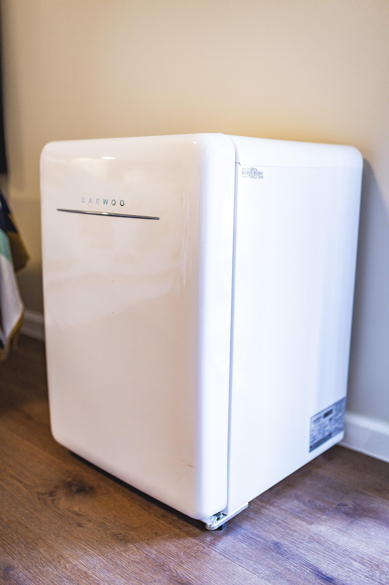
Retro-style mini-fridges from Daewoo look completely era-appropriate, but they’re Energy Star Certified. Even the adorable little Vornado fans on the side tables have an old-school aesthetic.
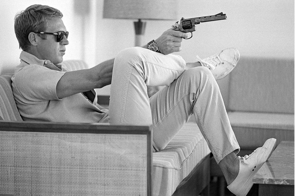
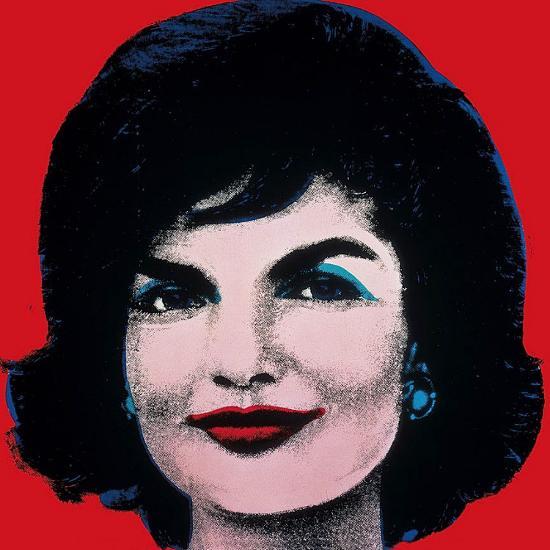
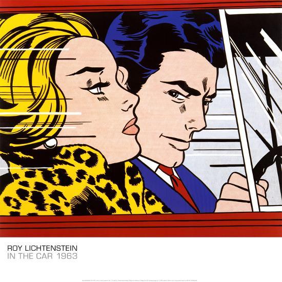
The artwork is also firmly placed in the 1960s. We have pop art designs from Andy Warhol and Roy Lichtenstein, and black and white southwestern prints from Ansel Adams. And we had to add some surreal whimsy with Frank Moth. The 60s were the space age, after all! My favorite is the Steve McQueen image. Something about Steve McQueen. It sits prominently on a shelf above our coffee bar so I can admire it when I go in to visit!
While I wanted the motel to reflect its 1960s roots, it was also important to have all the modern conveniences. To start, the door locks are managed by keypads rather than physical keys or cards. A custom code is emailed directly to our guests that is good only during their stay. They can check in without ever “checking in” at the office. They can walk straight into their rooms when they arrive, whatever time that may be.
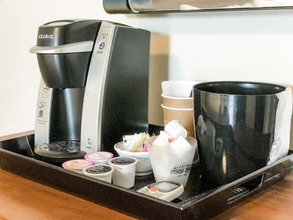
Every room comes with its own little coffee station with a Keurig machine, cream, and sweetener for an easy morning cup. And each room has a 32” flat screen Smart TV, where guests can unwind and stream their favorite movies on Netflix. Dual heat and air wall units keep the temperature just right, but you can switch on the cool, vintage Vornado fans for a little extra air.
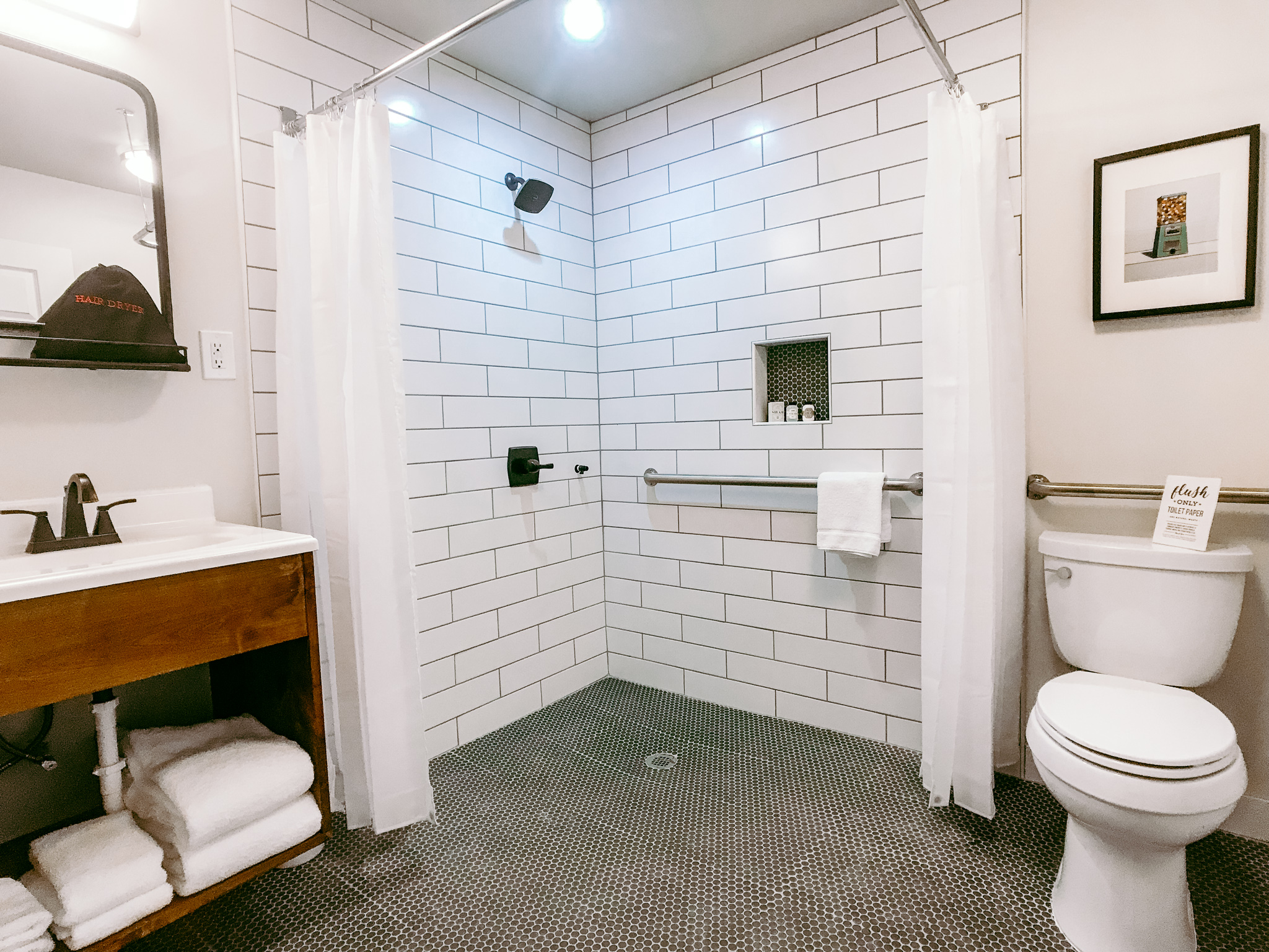
Not all the rooms at the motel are the same. We have two handicap accessible rooms, #7 and #8. These both have a larger door for easier access. They also have Euro-style baths, meaning there is no raised threshold leading into the shower. This allows guests in wheelchairs or with reduced mobility to easily get around and roll in for a shower.
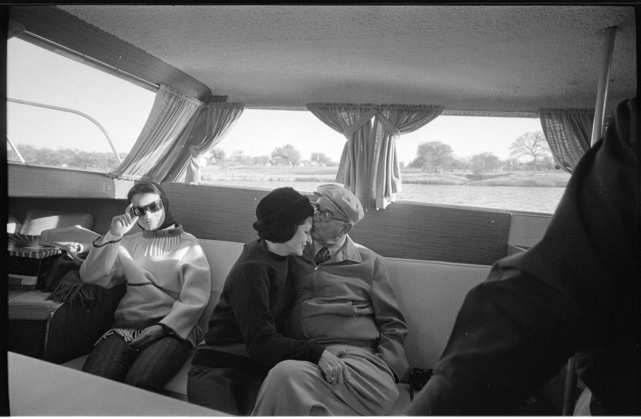
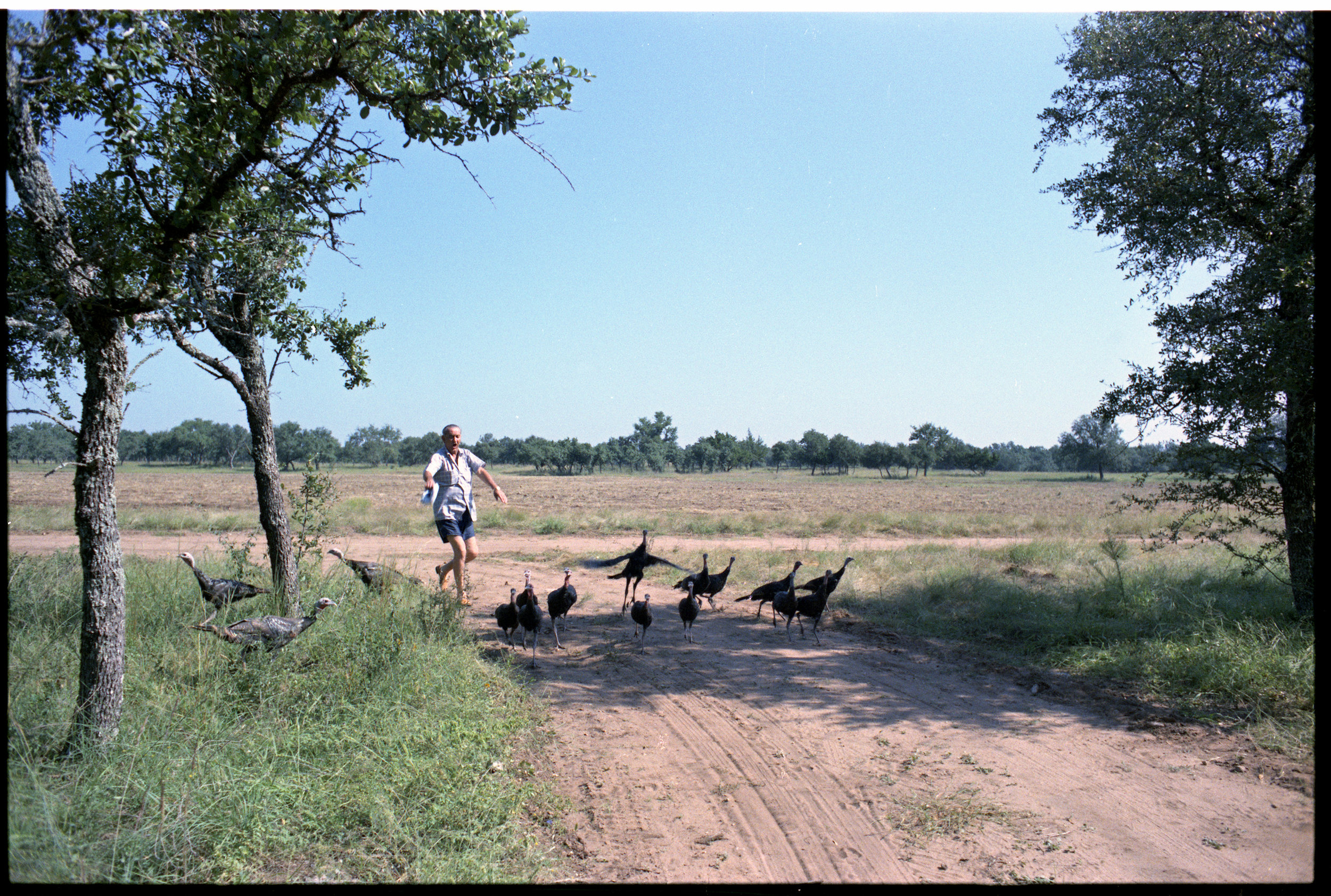
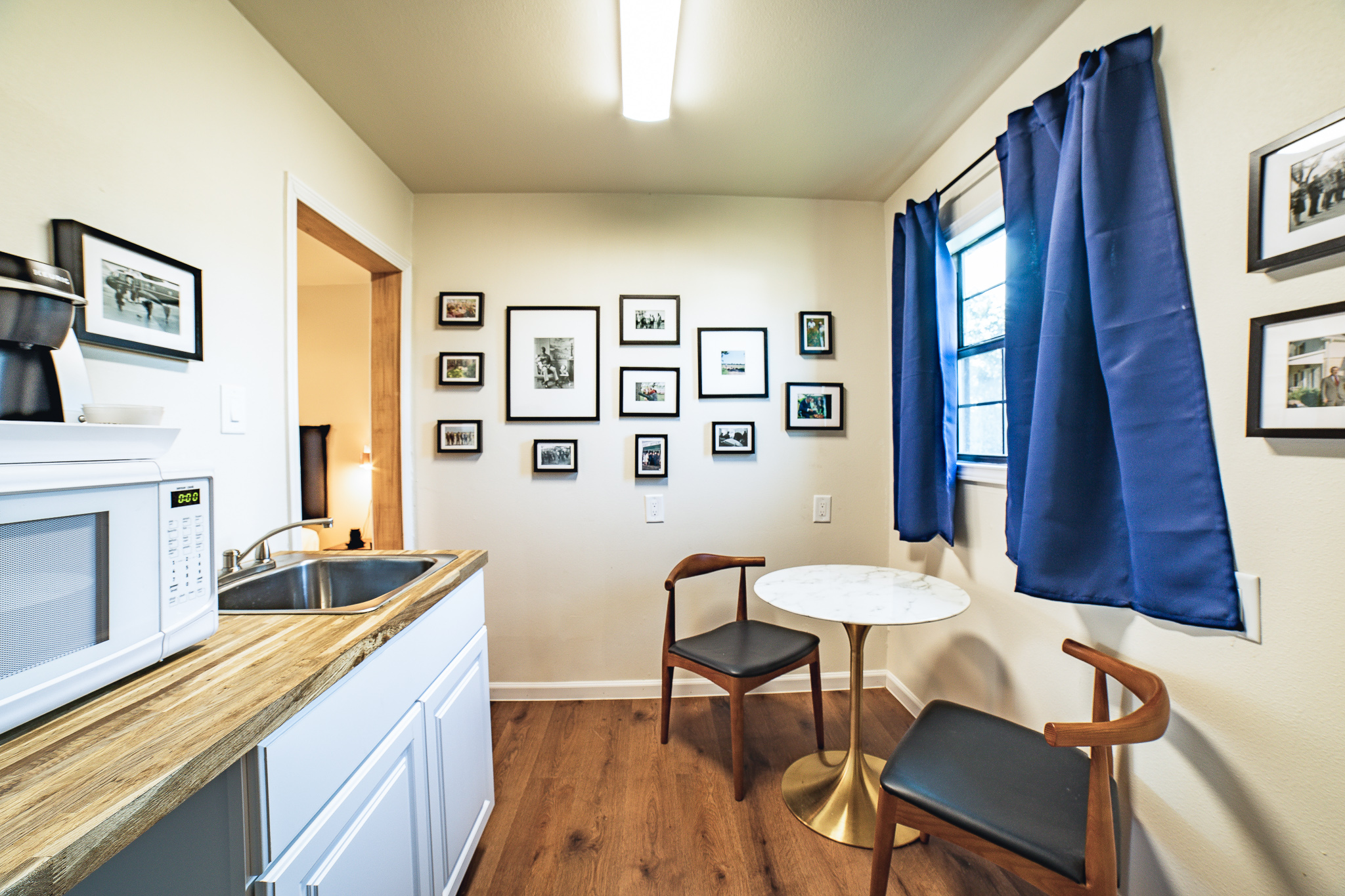
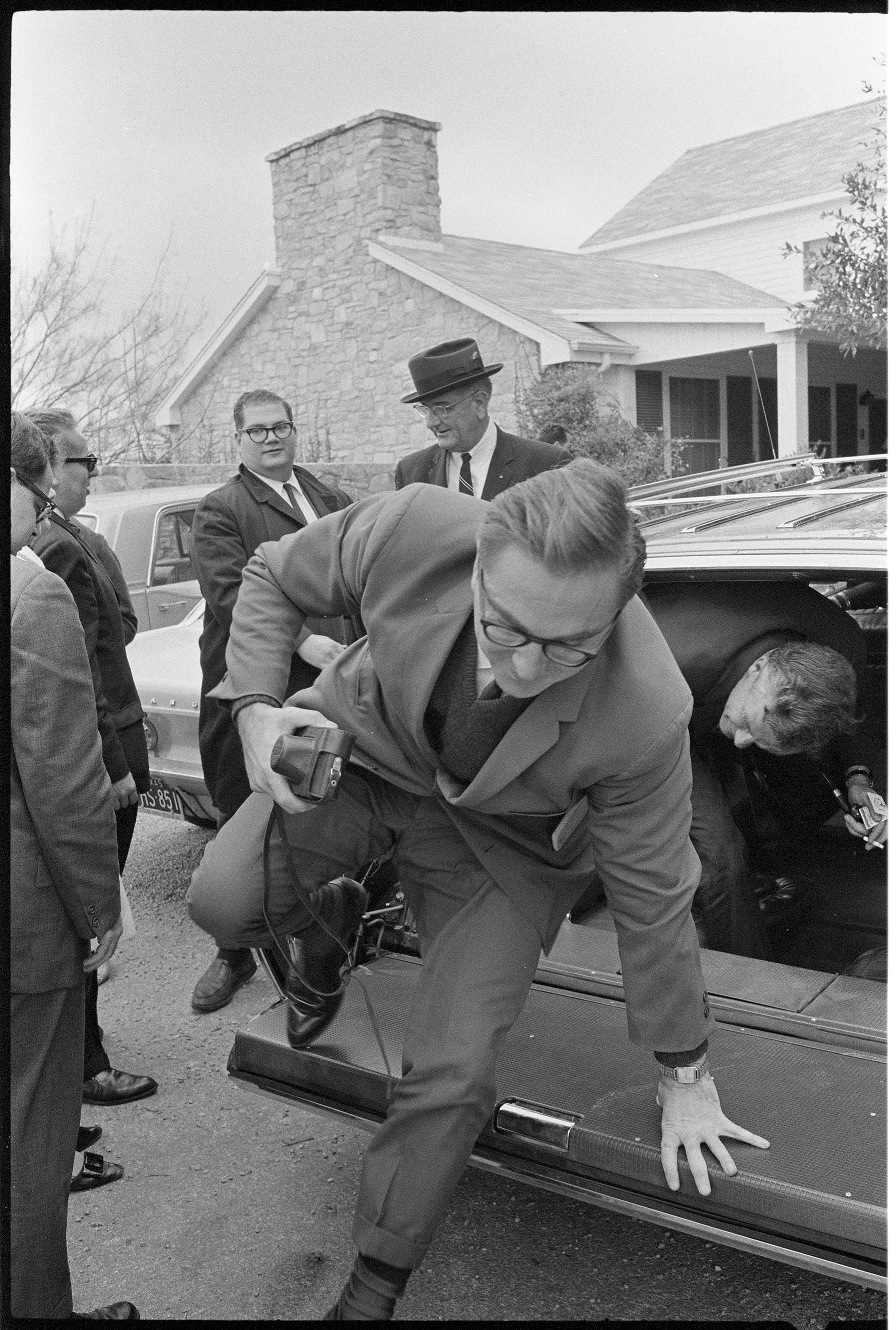
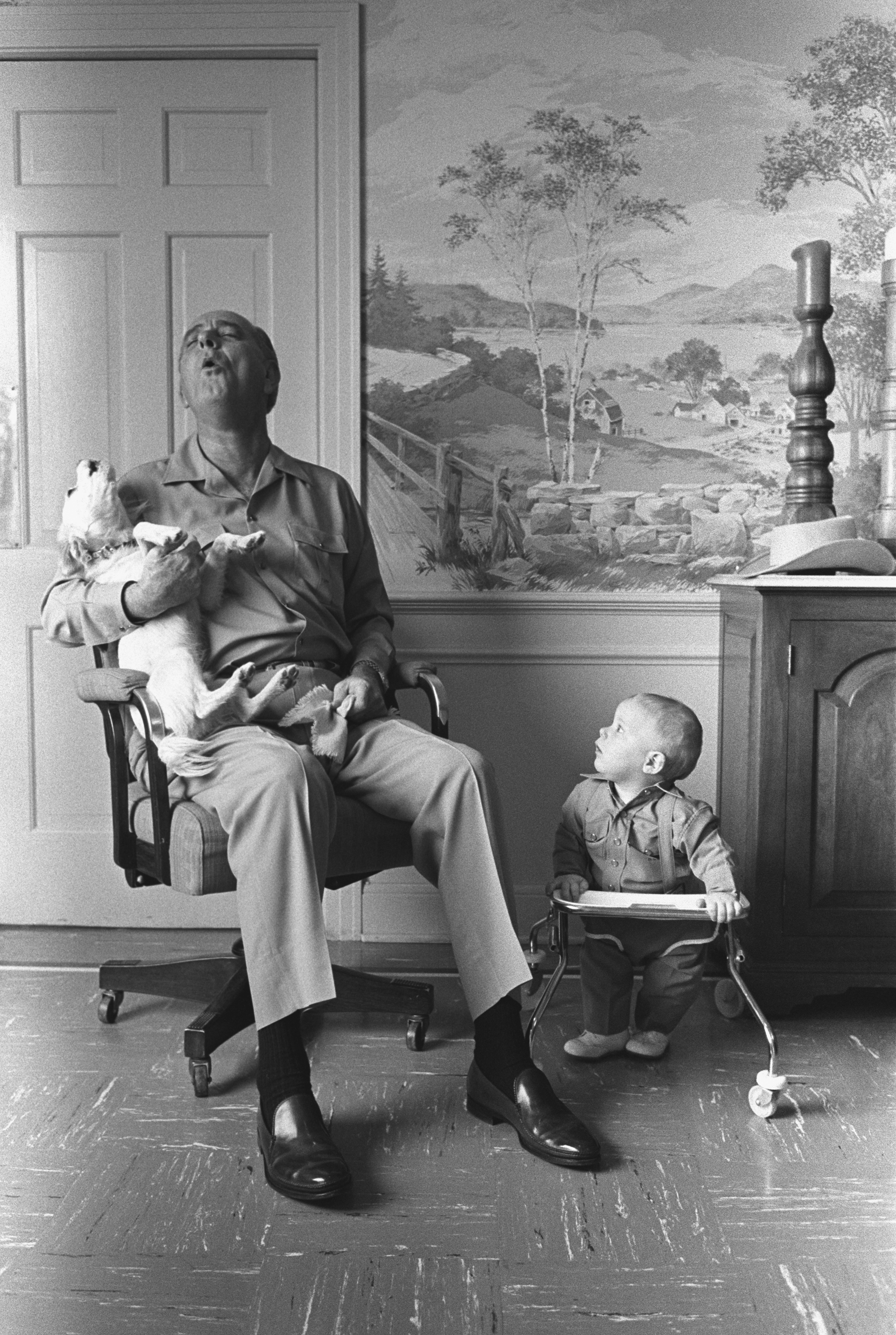
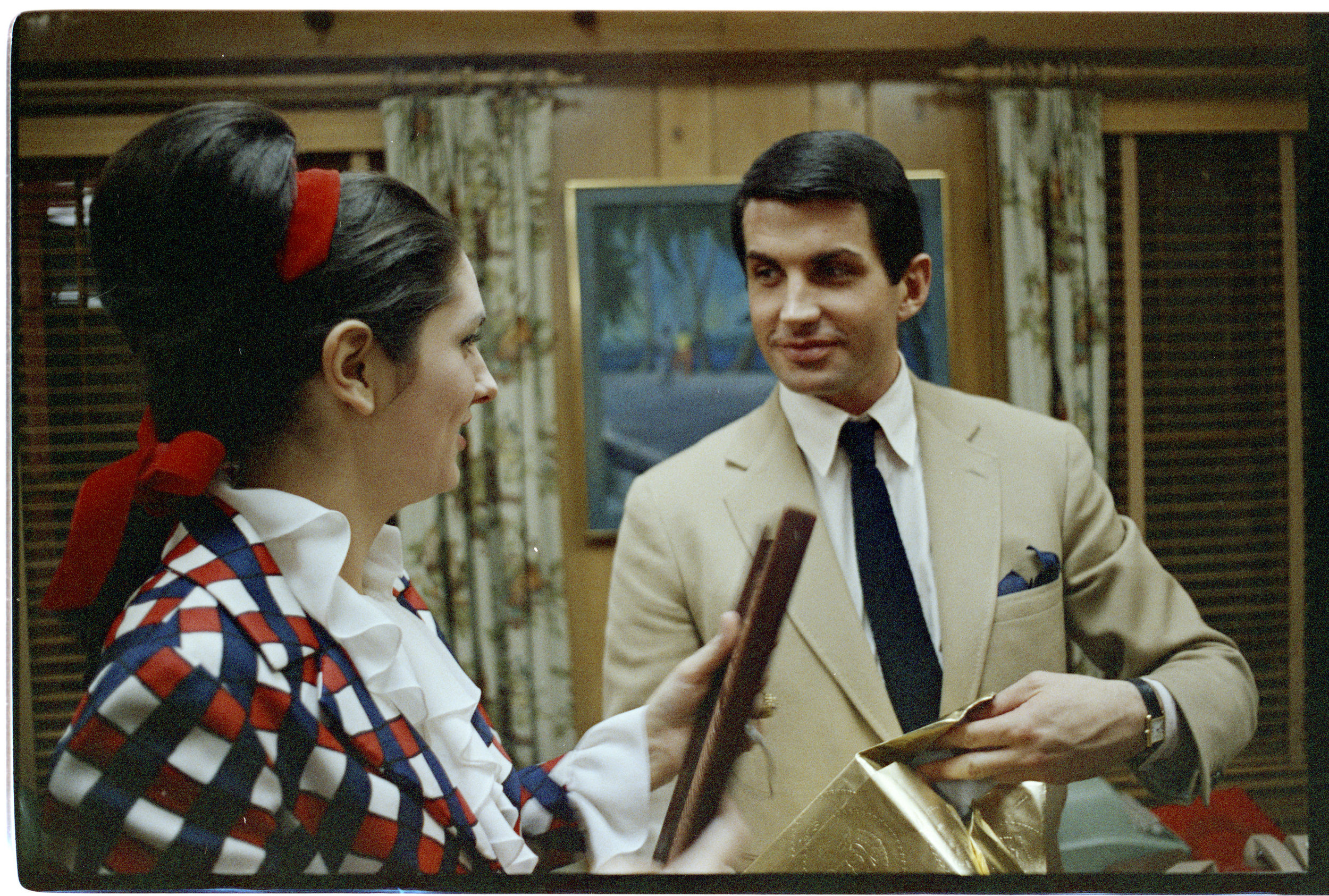
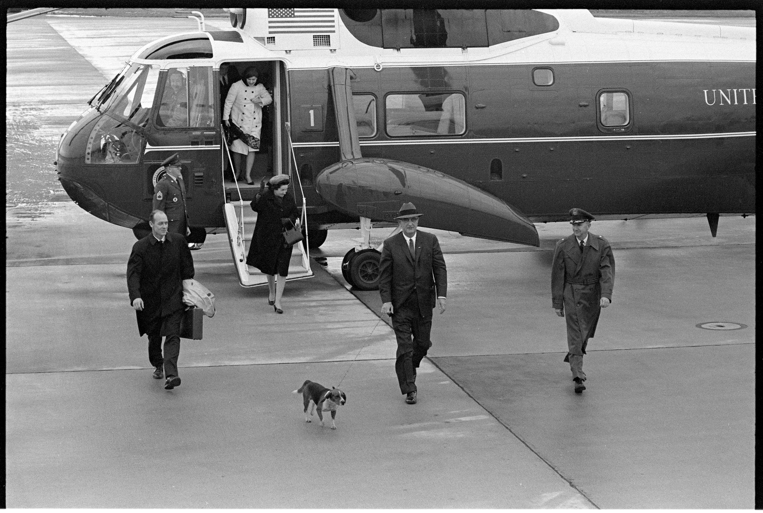
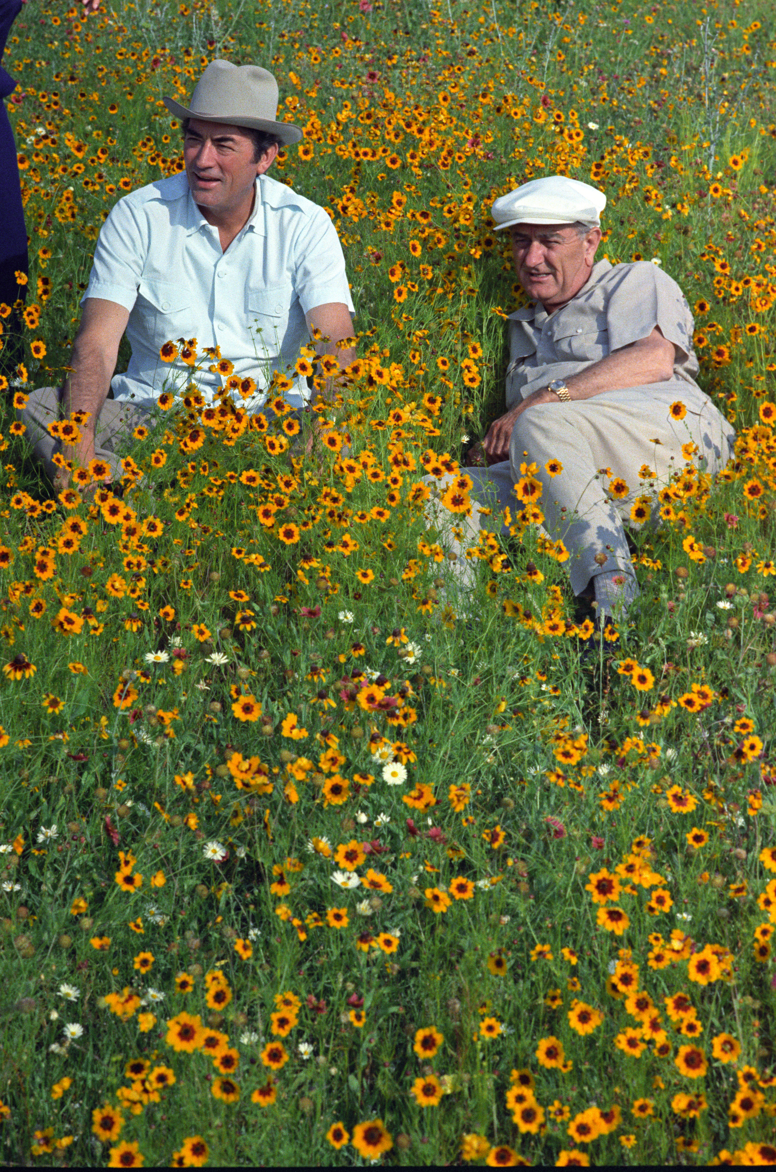
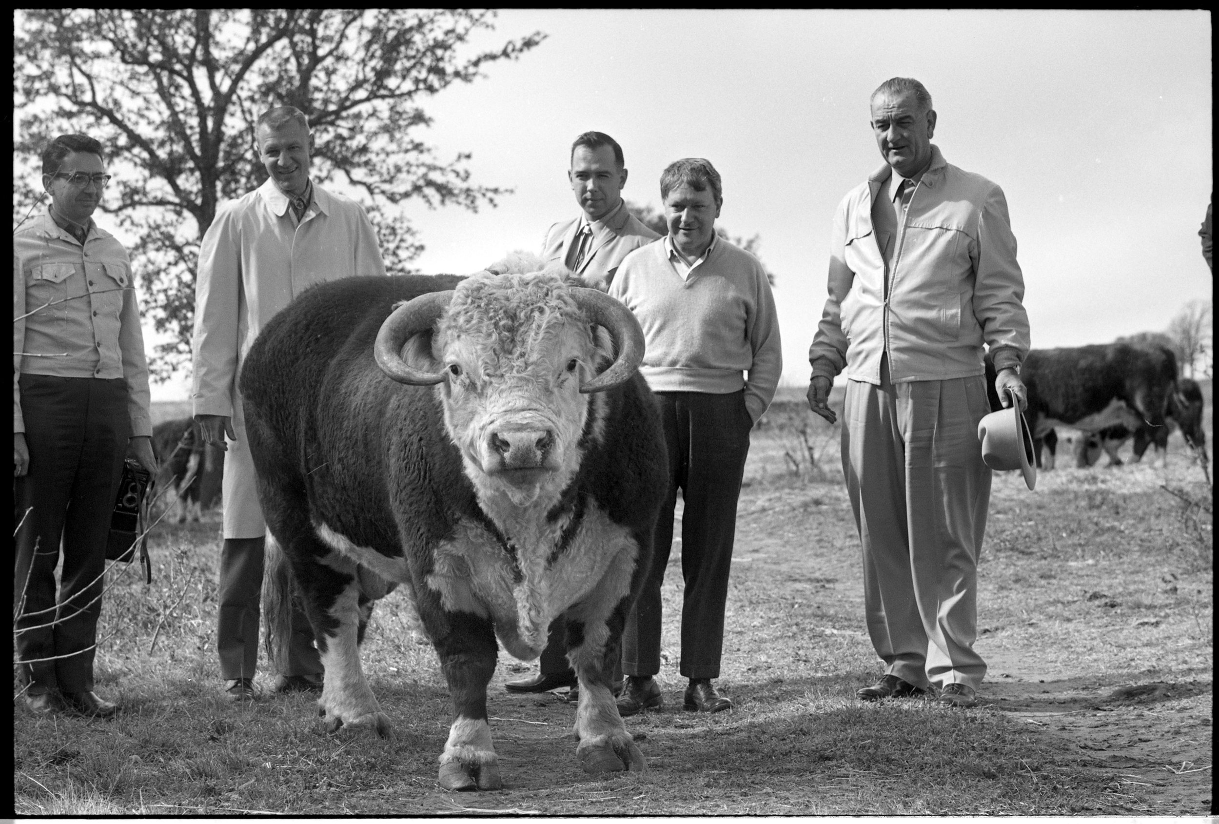
Room #8 is also the Press Room. The hotel was built to accommodate the US Press Corp when President Lyndon B Johnson was in town visiting his ranch next door. The original owners added a room in the back of #8 that was used as a darkroom for photographers who needed to develop images to get out on the wires. We kept the room’s history in mind and decorated it with pictures taken during that time LBJ’s presidency and taken in the Stonewall area. We visited the LBJ Presidential Library at The University of Texas and combed through some of their 600,000 images to find some gems. We intentionally curated photos that showed the personal side of LBJ, the Johnson family, and the famous people who came to little Stonewall to hobnob with the President. What a time that must have been! Photos of celebrities (George Hamilton, Buzz Aldrin, Gregory Peck), press legends (Walter Cronkite, Helen Thomas) and visiting dignitaries (then-Senator John F. Kennedy and President Richard Nixon) all adorn the walls of Room #8. The Press Room is also the only room that has its own kitchenette, with a full-sized fridge, microwave, and sink.





The Guest Bathrooms
We kept the bathrooms classic and neutral for the most part, with clean white wall tile and grey penny floor tile in the showers.
One of my favorite parts of this whole project is our custom wallpaper in the guest bathrooms. Marcy Swedlow at Mitchell Black printed our icon, created by Deux South, on the wallpaper that adorns some of the walls. It’s a fun way to make the bathrooms stand out in a more interesting way than simply painting a wall a different color.
Bathrooms were small in the 1960s (I think people were just smaller back then!), and we kept that footprint to stay true to the original motel’s design (with the exception of the handicap accessible and double queen rooms). But compact bathrooms meant we needed to come up with some creative space-saving solutions.
We opened up the stalls and increased the ceiling height, making it feel more roomy. We had custom walnut vanities made for each bathroom, mounted to the wall and floating off the floor. Floating vanities help make the rooms feel a little lighter and more spacious and makes cleaning easier for staff. Each vanity is topped with a bright white quartz sink. To help supplement the small sink area, we sourced a metal mirror that had a nice-sized shelf on it so guests can store personal items.
Each bathroom is supplied with William Roam premium bath products from their new Steam collection. They call this fresh, clean scent “an homage to a more elegant era”. If that doesn’t fit in with what we’re trying to accomplish here, I don’t know what does!
The Public Spaces
One thing the classic 1960s roadside motel wasn’t really known for was common spaces. These motels were a place to hunker down for the night on your way from point A to point B, rather than somewhere to congregate with friends.
But we want the SML to be a destination in itself, a draw to the area in the same way the wineries are. Part of that means encouraging people to gather here with a bottle of wine after a “hard day’s work” at the wineries or a cup of coffee.
One of the original features of the motel that I love is the second floor deck. We cleaned it off and gave it a new coat of stain, and it’s looking good as new. We have lounge furniture, dining tables and chairs to seat 20. It’s a great place to relax in the evenings under the warm glow of the string lights and stargaze. We sat up there on a recent Saturday with 20 of our guests, enjoying a cool breeze in the Texas Summer. Thanks to our good friend Oscar San Miguel, who was visiting that night, we are now affectionately calling it The SML Observation Deck! Look at this picture taken at dusk. Our guests are already ranting about the deck on our Facebook page.
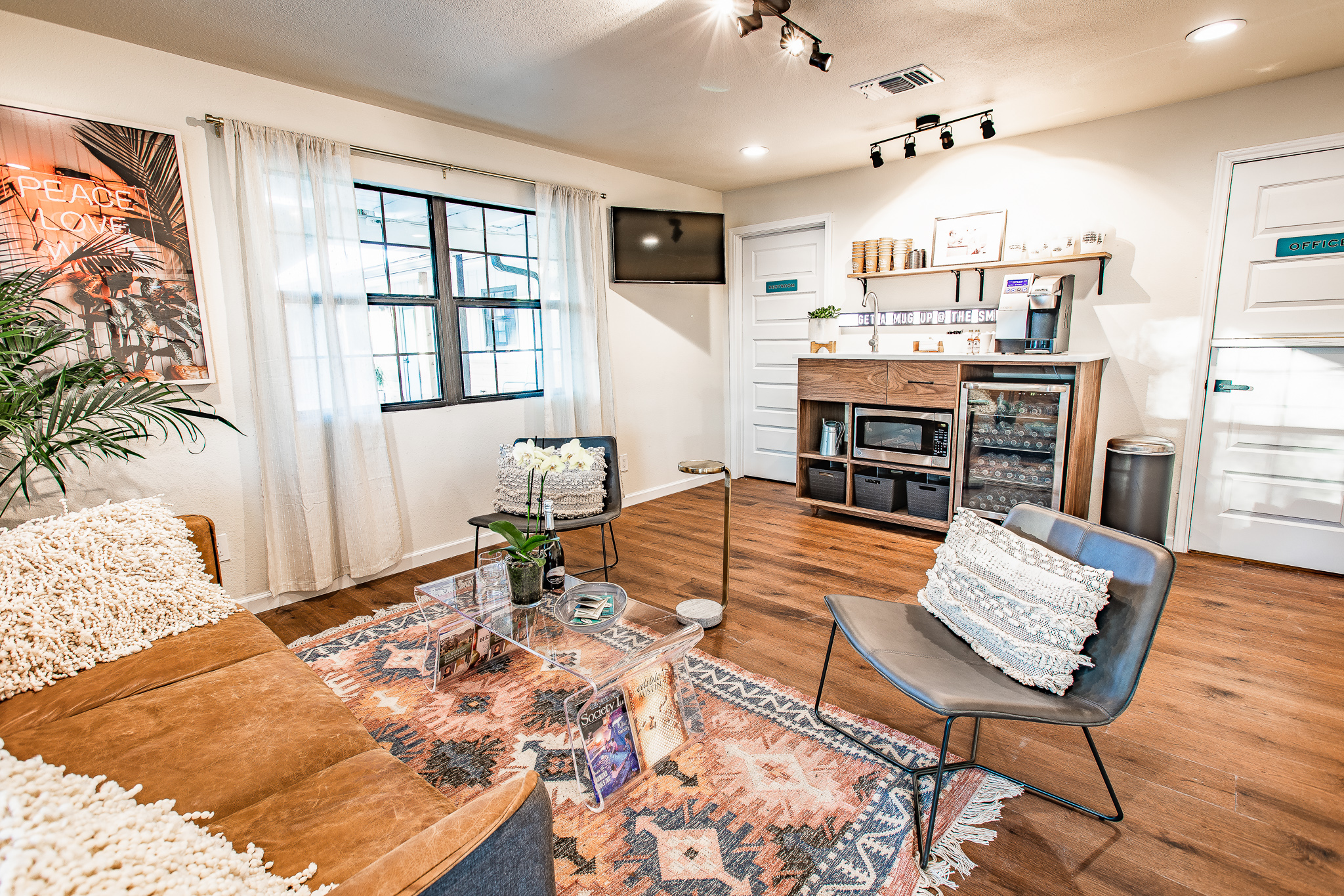
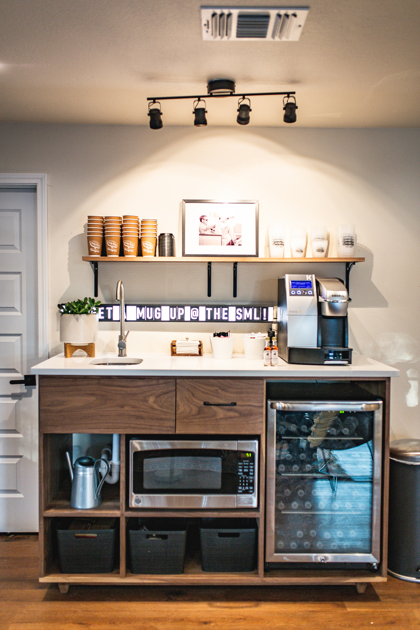
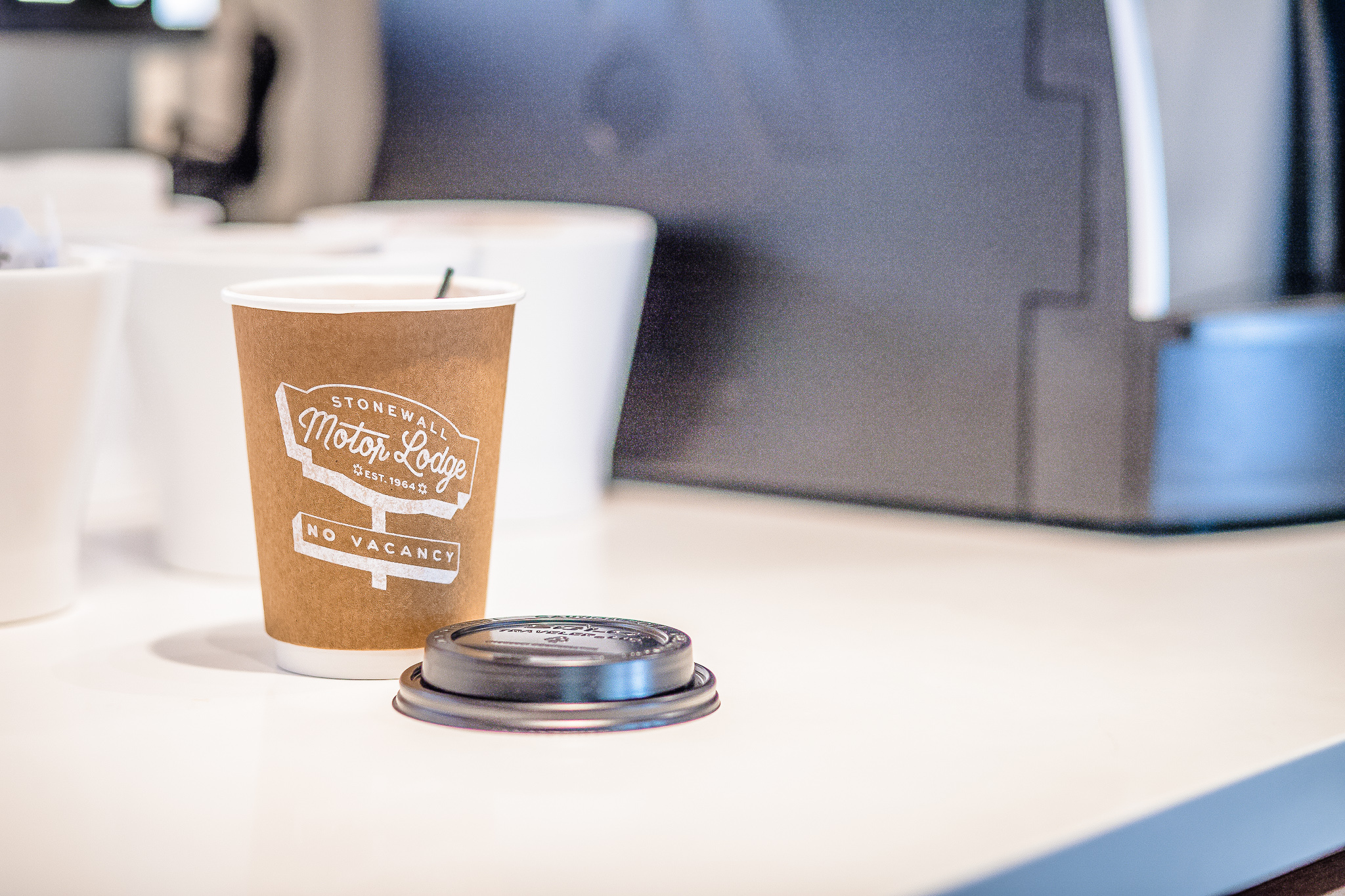
We also have an indoor lounge where friends can meet while they plan their day in the area. We had a custom self-serve coffee station built for the lounge, made of walnut with a white quartz top. Guests can get a cup of coffee from the commercial-grade Keurig machine while they consult our big, wall-mounted Official SML Road Map to the Hwy 290 Wine Trail, also designed by our friends at Deux South. They can leave with a small pocket-sized map so they know where they’re off to for the rest of the day.
We have a cozy leather couch and leather chairs to seat five, and a nice 42” flat screen TV for catching up on news or checking the weather before you set off. The lounge also holds a communal microwave and a wine fridge where you can chill your rosé to the perfect temp before you bring it up to the deck.
Marketing
To tie all this together and share with the world, we just finished our new website www.stonewallmotorlodge.com. Check it out!
Next up? Cabins. We’re waiting on delivery of cabins that will be placed out under the trees in what I’m calling the pasture. We sit on 3 acres, and the motel sits close to the front of that acreage off the highway. The back is covered with trees, quiet, and green. We’ll also be erecting another social space. An indoor/outdoor area for our guests to visit. I can’t wait to get started!
I’m so pleased with how the details all came together on this project in the last few weeks before we opened our doors. It’s such a great feeling to see our guests enjoy our hard work. What do you think?
We hope to see YOU soon!
Anita Ortiz Lubke
Below is a list of our wonderful vendors who went above and beyond for us. Thank you!
http://www.standardtextile.com
http://www.keuriggreenmountain.com
http://www.moeshomecollection.com via http://www.susanhatchsales.com
Enchanted Rock Granite Manufacturers - Stonewall, TX
Custom wood pieces - Valentin Romero in San Antonio
http://www.sertahospitality.com
http://www.designmaterialsinc.com
https://skylinefurnituremfg.com/
http://www.sherwinwilliams.com
http://www.economysignssa.com/
Ben Yanto Visuals photographer

